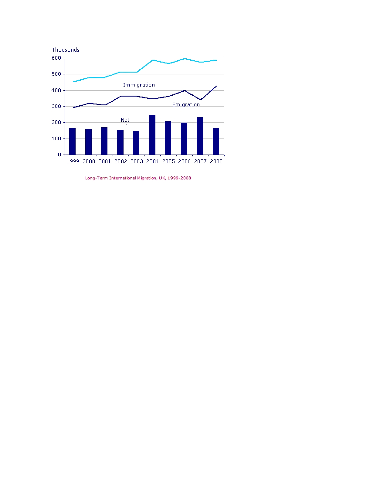
The given chart gives information about UK immigration, emigration and net migration over a period of 9 years from 1999 to 2008. During this time, the rate of emigration and migration showed increased where as net migration peaked at 2004 and 2007.
Turning to detail, the net migration rate stayed between 150,000 to 190,000 in1999 to 2003. In 2005, it reached to 200,000 and remains constant in the 2006. Though the year 2007, the rate of migration showed an increase nearly 220,000 at the end of the period it dropped to 180,000 which is same as the rate of 1999.
In case of the rate of migration, it started from 300,000 in the year 1999, shows negligible rise in 2000 and stayed roughly same in the three years following 1999. Then it increased and reached 380,000 thousand is the following year and remain steady for the year 2003, after a marginal gradual drop of 20,000 in the year 2004. However, in the next two years it raised continuously and touched at 400,000 in 2006. After a fall of 300,000 in the year 2007 it regained and peak at 2008 at the rate 2008 at the rate 420,000.
Immigration also shows increasing trend from 1999 to 2000, remained the same for the next year, and reached at just above 500,000 in 2003 a growth in 4 years. Then it increased significantly, reached just under 600,000, fluctuated between 680,000 and 600,000 in the following four years, and reached to just below 600 thousand in 2008.
In short, the net migration ended in 2008 at the same level as it started in 1999. Immigration and emigration shows an increase of nearly 150,000 in 9 years.
The given chart gives information about UK immigration, emigration and net migration over a period of 9 years from 1999 to 2008. During this time, the rate of emigration and migration showed increased where as net migration peaked at 2004 and 2007.

graphs_diagrams1pa.jpg
