Unanswered [0]
  

Home / Writing Feedback   % width   Posts: 2


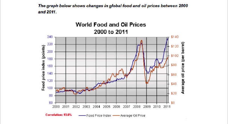
The graph below shows changes in global food and oil prices between 2000 and 2011


Nhiovl155 1 / -  
May 23, 2021   #1

world food and oil prices


The line graph compares the average price of a barel of oil with the food index from 2000 to 2011.
Overall, the value of both oil and food witnessed upward trends over the eleven-year period. In addition, the changes of both commodities were relatively similar.

In particular, in the year 2000, food price index was around 20 points, while oil cost roughly 20$ per barrel. Thereafter, there were insignificant rises in both figures to about 110 points for the former and 30$ for the latter. In the next four years, a sharp increase was observed in food price index which doubled to over 220 points. A similar tendency could be seen in that of oil, which soared and peaked at approximately 130$ at the same point.

In 2009, oil price crashed to around 40$, at which it bounced back to under 100$ after a three-year period. Whereas, the worth of food also registered a suden fall to 100 points. Subsequently,there was growth its price, which reached a peak of 240 points at the end of the period.

  • Screenshot_2021052.png


Holt  Educational Consultant - / 15463  
May 24, 2021   #2
Did you see the correlation listed in red within the image presentation? Why didn't you include it? Being listed in red means this is important data that must be highlighted as the tending sentence in the report summary and within the presentation paragraphs.

barel

LR concern: Wrong spelling. You need to avoid spelling e56ors to avoid LR deductions.

The rest of the essay is good enough. You presented a basic understanding of the image and graph movement. The reader can create an interesting mental picture of the report based on your simple reporting style. The presentation is worthy of an averagepassing score at this point. Like I said, there was a missing important trending information presentation that was overlooked but it won't have a grave negative effect on your final score.


Home / Writing Feedback / The graph below shows changes in global food and oil prices between 2000 and 2011
ⓘ Need Writing or Editing Help?
Fill out one of these forms for professional help:

Best Writing Service:
CustomPapers form ◳

Graduate Writing / Editing:
GraduateWriter form ◳

Excellence in Editing:
Rose Editing ◳

AI-Paper Rewriting:
Robot Rewrite ◳