Unanswered [1] | Urgent [0]
  

Home / Writing Feedback   % width   Posts: 2


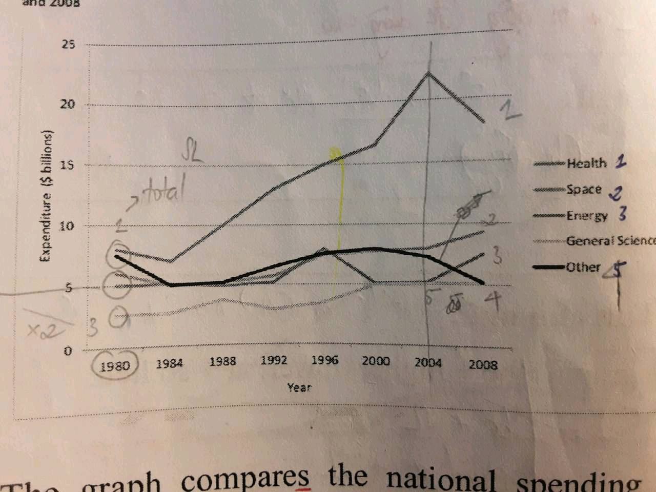
The graph below shows information about US government spending on research between 1980 and 2008


hoan 1 / -  
Jul 25, 2021   #1

research expenditure in the us


The line graph depicts the amount of national expenditure which was spent on five different categories/sectors of research in the US from 1980 to 2008.
Overall, it is clear that the US national spending on all sectors of research increased over the period given, except for Other. Whereas the US Government used their money more on Health research, General Science was spent the least.

Looking at the details, in 1980, the US expenditure on both Health and Other researches were around 8 billion dollars, while the figure for Space, Energy and General science was lower, approximately 6,5, and 3 billion dollars respectively. During the next 24 years, whereas the amount of spending on Health increased considerably, peaking at about $22 billion, that of other categories fluctuated from roughly 3 to 7 billion dollars throughout this period.

In 2008, Health research witnessed a decrease in spending allocated, declining to about $17 billion. A similar trend was seen in the expenditure for Other research, with a decrease of around $5 billion. By contrast, the figure for Space and Energy rose to about 8 and 5 billion dollars respectively and there was no change at that of General Science, remaining at 5 billion dollars.

  • 219976511_8827055423.jpg


Holt  Educational Consultant - / 15385  
Jul 26, 2021   #2
For comparison measurements, the writer will do well to use any of the following comparison standards:

- Year on year
- Decade to decade (every 10 years)
- Quarter Year to Quarter year (every 25 years)
- half century to half century (every 50 years)
- Century to century ( every 100 years)

These are the average comparison cutoffs used for data analysis as it tends to use the most similar measuring criteria for analytical purposes. It is more difficult to create a believable comparison point for 24 years.

Avoid compressing different categories and sectors into one sentence. This is considered a run-on sentences a grammatical error. It is best to use the 3rd comparison point as a seperate presentation for clarity purposes. Use 3-5 sentences per paragraph for the sake of reader understanding.

The presentation format is acceptable. save for some run- on instances, the comparison discussions are easy to follow. Simple data analysis are constantIy portrayed throughout the presentations.


Home / Writing Feedback / The graph below shows information about US government spending on research between 1980 and 2008
Need Writing or Editing Help?
Fill out one of these forms:

Graduate Writing / Editing:
GraduateWriter form ◳

Best Essay Service:
CustomPapers form ◳

Excellence in Editing:
Rose Editing ◳

AI-Paper Rewriting:
Robot Rewrite ◳

Academic AI Writer:
Custom AI Writer ◳