Unanswered [1]
  

Home / Writing Feedback   % width   Posts: 3


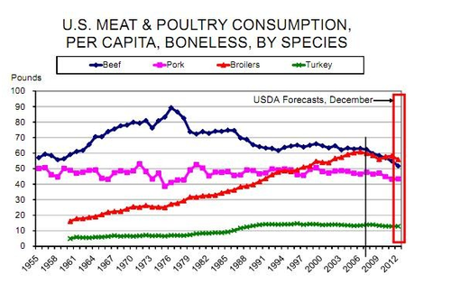
IELTS WRITING TASK 1 The graph below shows trends in US meat and poultry consumption.


johnle29 4 / 9  
Jan 31, 2020   #1

trends in US meat and poultry consumption


The line graph compares the intake of meat and poultry in the US from 1995 to 2012.

At first glance, it is noticeable that beef was the most popular type of meats over most of the time frame. However, the most dramatic increase was seen in the broiler consumption.

In 1955, over 55 pounds of beef were consumed by the avreage American, compared to 15 pounds of broilers. Over the following two decades, both beef and broilers showed a similar pattern, with the amount of the former reaching its peak of 90 pounds per person in 1976. However, this advance was followed by a downfall as beef intakes fell to just above 50 pounds in 2012. Meanwhile, the figure for broilers witnessed a steady growth to a level of 55 pounds per capita in the final year, surpassed the amount of beef eaten and became the most favored type of meat.

By contrast, the quantities of pork and turkey were quite stable throughout the period. The trend for pork consumption was downward with some mild fluctuations varying from 40 to 50 pounds before finishing the period at around 43 pounds every person, whereas the pork was the least popular meat as its statistic only remained round 10 pounds despite a slow growth in its intake.

  • IELTS_Writing_Task_1.png


Phuongbo 4 / 9  
Jan 31, 2020   #2
In third paragragh I think that they are " the trend of pork" and "the quantities of pork and turkey consumption" , they weren't the quantities of pork and turkey

In addition, the trend of pork wasn't stable, in subsequent sentence, you written that " it had some fluctuation". I think fluctuation and stable trend are different
Holt  Educational Consultant - / 15461  
Jan 31, 2020   #3
While this presentation is good enough to help assess your English writing and comprehension abilities, you should have considered how you will make your comparisons more accurate for the reader. Since the chart shows that the comparisons are beef and pork, chicken and turkey, you should have done your comparison in the same manner. Compare meats by type otherwise, the information presentation does not make sense.

Comparisons are done for similar, not different items. It is difficult to explain why you are comparing non-related items. It is better to do the comparison by pair or grouping. Therefore, the comparisons, though acceptable, would have made more sense if you had done the proper meat type comparisons, beef vs. pork, and turkey vs. chicken. It would have made for a far more interesting comparison discussion as well.

Again, there are no wrong presentations for this essay. However, highlighting the discussions as per the prompt suggestions would help increase your TA score. It shows your ability to properly analyze and discuss the given chart in relation to implied discussion standards.


Home / Writing Feedback / IELTS WRITING TASK 1 The graph below shows trends in US meat and poultry consumption.
ⓘ Need Writing or Editing Help?
Fill out one of these forms for professional help:

Best Writing Service:
CustomPapers form ◳

Graduate Writing / Editing:
GraduateWriter form ◳

Excellence in Editing:
Rose Editing ◳

AI-Paper Rewriting:
Robot Rewrite ◳