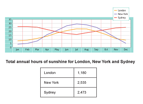
The graph and table below show the average monthly temperatures and the average number of hours of sunshine per year in three major cities.
Summarise the information by selecting and reporting the main features, and make comparison where relevant.
The line graph illustrates a breakdown of the mean temperature per month during a year, and the table gives information with regard to the average number of hours of sunshine in different cities. At first glance, it is evident that Sydney has a higher temperature than other cities over the period. Noted, New York was the highest number of hours of hours of sunshine in three major cities.
According to the line graph, it shows that the average of monthly temperatures in Sydney was decreased before it gets a massive at the end of month. This figure was stood at under 25 in January. While, this trend had remained stable over the next three months before it experienced a dramatic decline at around 16 in July. There was a significant increase at 25 in the end of period, with the total annual hours of sunshine at 2,535.
Moving to a more detailed analysis from the graph and table, it reveals that London and New York temperatures had a similar pattern, even though both figures had a big gap for the total annual hours of sunshine. Both figures stood at under ten, and then increased slightly over the next six months before those figures fell back at under ten. Finally, the total annual hours of sunshine in London and New York were 1,180 and 2,535 respectively.

task1_02_06_2015.PNG
