Unanswered [1] | Urgent [0]
  

Home / Writing Feedback   % width   Posts: 4


Information about the percentage of four groups in the total population of New Zealand


nVy1104 1 / -  
Jun 27, 2021   #1

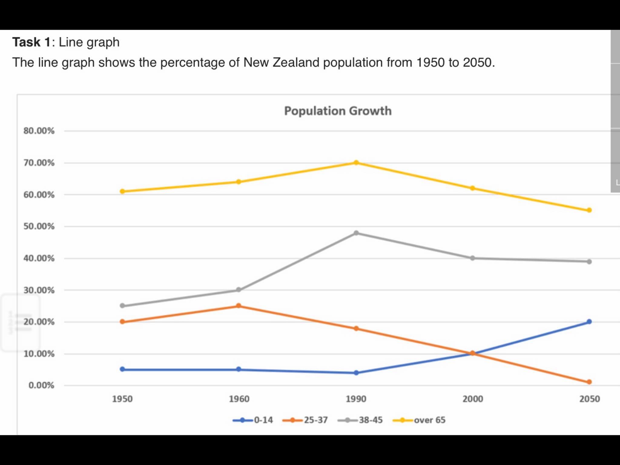
the percentage of new zealand population from 1950 to 2050


The graph provides information about the percentage of four groups in the total population of New Zealand between 1950 to 2050. Overall, the population aged from 25 to 37 and over 65 is predicted to be on a decrease, while the opposite was seen in the other two groups. New Zealand's elderly people have been experiencing the dominance in total population.

In 1950, the proportion of the population under 14 years old stood at about 5%, while, people aged over 65 is nearly 61%. Population aged from 25 to 37 and 38 to 45 stood at 20% and approximately 25% respectively, which is only 5% apart. Nevertheless, while the figure for those is adult, middle and retiree is tended to increase in 1960, the figure for children under 14 maintained stable for much this period.

In the next 40 years, the two oldest groups reach a peak at 70% and about 50%, before falling to 55% and 40% respectively in 2050. While a sharp rise is predicted in the population under 14 years old, the proportion of the other group will experience a fall before the top out in 2050.

  • 203012142_5930513823.jpg


Holt  Educational Consultant - / 15370  
Jun 28, 2021   #2
There are several types of graphs involved in this writing test. A graph is a general reference to the image, which does not accurately inform the reader. A graph can never be mistaken for a live graph unless it is properly identified as such. The information sauce for the 4 age groups should also be listed in the summary for overview accuracy. The writer must not create only a partially accurate listing with a refference to "the other 2 groups". Completely listed information sources adds to the summary accuracy. The analysis could be more complete. 2 sentence presentations means the writer is reporting on easily seen data and skipping the deeper analysis pertaining to information equivalency in the graph.
xiaoyuaini 1 / 2  
Jun 28, 2021   #3
I think you should provide the exact name of the chart type that you are writing, it will help you get higher score.
Dexterity 1 / 2  
Jun 28, 2021   #4
Dear nVy1104,

Although I am not sure how this will be graded, I felt lost during some portions of this piece. You constantly cite statistics from the chart that, while accurate, can lead be confusing at points. Instead, perhaps use words like decline, increased, or fell sharply may add some more variety style while simultaneously making it a bit more clear for readers.


Home / Writing Feedback / Information about the percentage of four groups in the total population of New Zealand
Do You Need
Academic Writing
or Editing Help?
Fill out one of these forms:

Graduate Writing / Editing:
GraduateWriter form ◳

Best Essay Service:
CustomPapers form ◳

Excellence in Editing:
Rose Editing ◳

AI-Paper Rewriting:
Robot Rewrite ◳

Academic AI Writer:
Custom AI Writer ◳