Unanswered [2] | Urgent [0]
  

Home / Writing Feedback   % width   Posts: 5


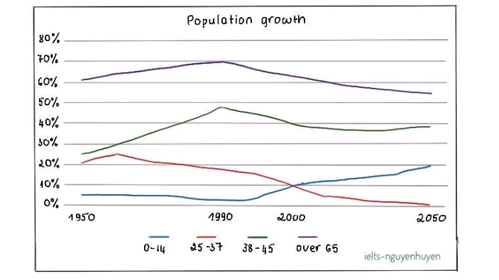
The line chart illustrates the population growth in New Zealand between 1950 and 2050


lethiaixuan 2 / 4  
Jun 5, 2021   #1

New Zealand population analysis


The line chart illustrates the population growth in New Zealand between 1950 and 2050.
Overall, the percentage of New Zealand population aged 65 and over dominated over the period show on the graph. While the age of 14 and under saw an increase, the people falling into the 24 to over 60 age group had fallen.

In the year 1950, over 60% of population of New Zealand was the people aged over 65. The respective figure for people between 25-37 and 38-45 was around just over 20% and 25%. The proportion of children falling Into the 0 to 14 age group made up the lowest percent was close to 5%. Over the following 40 years, the 38-45 age people reached its peak, to nearly 50% percent and with the older group rose by around 9%. However, the 25 to 37 age group was down by about 5% and the 14 and under fell steadily in the same period.

From 1990 to 2050, there was a dramatic increase in the people between 0 to 14 age, to nearly 17%. By contrast, the people falling into 38-45 age group dropped to almost 1%. The number of people old aged group had fallen by approximately 15% and 10% for 38 to 45 one.

Hope to receive your comments


  • Capture.PNG

  • Capture.PNG


Holt  Educational Consultant - / 15384  
Jun 6, 2021   #2
dominated

The image showed a decline. Why did you say it dominated when the chart showed the highest fluctuation resulting in a steady decline leading into 2050? There is an incorrect analysis in the presentation regarding that section. It isn't 24-65, just 65 year olds.

The respective figure ...and 25%

Use a comparative sentence format for this presentation. Your current presentation is flat and not really informative. make your presentations more lively in an informative manner.

Over the following 40 years

You should refer to the year directly either in a parenthesis or work it into the sentence for clarity and accuracy.

Your overall presentation lacks in creative comparisons that could help boost your LR and GRA scores. While being direct is fine, it sometimes causes a bit of confusion in your presentation. To avoid that next time, consider using a more active voice writing pattern.
OP lethiaixuan 2 / 4  
Jun 7, 2021   #3
@Holt
Thank you so much. I am trying my best but there are some I do not understand. It is kind of you when you give me advice and your email for contact.Thank again.
thanhtien2512 1 / 1  
Jun 7, 2021   #4
You made a small mistake. It should be "over the period shown."

"The porpotion of children falling into... 5%" I think you can simplify it like this : "The children in the age range of 0 to 14 made up just 5%, which was the lowest among 4

age groups." I think this is easier to understand ^^

The last sentence: "The number of people old.... for 38 to 45" It sounds pretty unclear. You may want to describe the age group clearer. For example:"The 38-45 age group and the people aged 65 and above both witnessed downward trends, respectively 10% and 15%"

That is just my humble opinion. Have a good day :)
OP lethiaixuan 2 / 4  
Jun 7, 2021   #5
@thanhtien2512 ,Thank you sometimes i make some mistake with typos and difficulty express my train of thought. I will pay more attention .Thank you for your comment. It is so kind of you.


Home / Writing Feedback / The line chart illustrates the population growth in New Zealand between 1950 and 2050
Do You Need
Academic Writing
or Editing Help?
Fill out one of these forms:

Graduate Writing / Editing:
GraduateWriter form ◳

Best Essay Service:
CustomPapers form ◳

Excellence in Editing:
Rose Editing ◳

AI-Paper Rewriting:
Robot Rewrite ◳

Academic AI Writer:
Custom AI Writer ◳