Unanswered [6] | Urgent [0]
  

Home / Writing Feedback   % width   Posts: 3


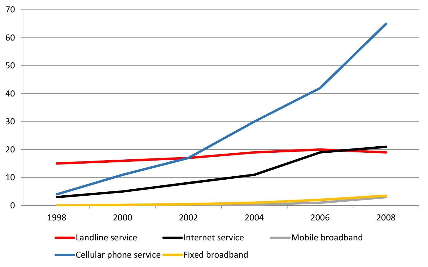
(ielts task 1) The line graph shows the number of people who used different communication services


adamneyul 1 / -  
Dec 7, 2021   #1

The data of communication services usage


The line graph illustrates the proportion of individuals who utilized five different communication services, namely landline, internet, mobile broadband, cellular phone, and fixed broadband over a period of ten years, starting in 1998.

Overall, it can be clearly seen that there has been some growth in all the services over the 10-year period, especially the cellular phone service, which witnessed the highest growth in users and has become the most popular form of communication.

In 1998, the proportion of landline service users was the highest, at 15%. This method of communication remained quite stable. However, in 2008, the number of customers who utilized landline service declined to 10% of customers. By contrast, the figure for cellular phones witnessed an escalating trend that started at 5% in 1998 and skyrocketed to 60% in 2008. Similar to the cellular field, online communication rose progressively by 15% to reach its highest point at 20 users per 100 people, surpassing the number of landline service customers in 2006 and more than this method of communication by 10% in 2008.

In 2002, mobile and fixed broadband had to be introduced. The figure for these services increased slightly, to nearly 3% of inhabitants for each service in 2008. Throughout the period given, the rank of the most attractive services utilized by dwellers changed significantly, with cellular service standing first, followed by internet service and landline service, and finally mobile and fixed broadband service, which was the least popular service.

  • IETLSWritingrecent.jpg


Holt  Educational Consultant - / 15388  
Dec 8, 2021   #2
While I understand that it is easier for you to write a compressed sentence for the summary overviww, the formst you have chosen to represent your summary does not fully allow for summary clarity due to the confusing flow of information. Too much information is being preented in the single sentence that normally, should be divided into at least 3 sentences. In this case, the more relaxed and easier to remember summary would have been:

Sentence 1 - Image type and discussion focus
Sentence 2: Listing of image information
Sentence 3: Start and ending point of the measurement
Sentence 4: Measurement type
Sentence 5: Trending sentence (if a paragraph is not necessary)

A sentence is normally considered more informative by the reader when it presents one stand alone piece of information to the reader, within a related paragraph presentation. That is because the information becomes scannable and easier to memorize for the reader When compared to a run -on sentence, the possibility of a confusing grammar presentation is avoided and, a better score can be given to the exam taker.

starting in 1998.

Although you did mention a decade coverage for the presentation, the mere fact that the starting and ending months are mentioned in the image itself requires you to present the end date as well. Again, this is for clarity purposes and in deference to people who may not have the time to count 10 years as they read your prsentation. Yes, it seems to be a dumbed down way of presenting the information. However, in a task 1 essay, which is based on clear data reporting, informing the reader about highly specific information helps increase your overall score due to the proper use of information and presentation clarity within the paragraphs.

There is a part of this report that requires you to make comparisons where relevant. The overlapping information from 2002 should have been reported in the presentation as an equivalency point where the measurement for landline and cellular phone services were equally represented. That is a pivotal measurement point that you should have mentioned as a part of a proper analysis if the image.
monicaaa0017 7 / 14  
Dec 19, 2021   #3
In paragraph 2, try to separate the sentence. Do not make all in one sentence. Because in general, one paragraph should contain at least 1 sentence.


Home / Writing Feedback / (ielts task 1) The line graph shows the number of people who used different communication services
Need Writing or Editing Help?
Fill out one of these forms:

Graduate Writing / Editing:
GraduateWriter form ◳

Best Essay Service:
CustomPapers form ◳

Excellence in Editing:
Rose Editing ◳

AI-Paper Rewriting:
Robot Rewrite ◳

Academic AI Writer:
Custom AI Writer ◳