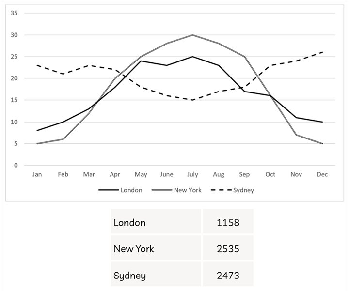
The line graph and table show the average monthly temperatures and annual hours of sunshine in three major cities. Summarise the information by selecting and reporting the main features, and make comparisons where relevant.
---
The graph and table illustrate the temperatures on the monthly average and sunshine's annual hours in selected cities. In general, the number of London's temperatures is similar to the figure for New York's ones, while the number of the monthly temperatures in Sydney differs from them. It is also seen that the number of sunshine's hours in New York and Sydney is high significantly, which is higher than it for sunshine's London hours.
Regarding to the graph, the nunber of the New York temperature soars in the first seven months, reaching the highest at 30 degrees. London city also witnesses a rather remarkable increase of the temperatures at this time, at 25 degrees, but it has a slight fluctuation between May and July. Although rising strongly from July to December, the figure for temperatures of two destinations plummets, and London's hit the lowest, at 5 degrees. By contrast, it in Sydney is different from the others. From January to July, it moderately drops by around 8 degrees, marginally fluctuating between January and March. However, in the final months, going up fairly, it reaches approximately at 26 degrees.
In term of the given table, the figure for sunshine's yearly hours in New York is the most considerable at 2535 hours, following by the number for 33them in Sydney at 2473 hours. They are nearly twice as high as the figure for the hours of sunshine in London. In this city, it just has 1158 sunshines's hours.

image4_1638610038_16.jpeg
