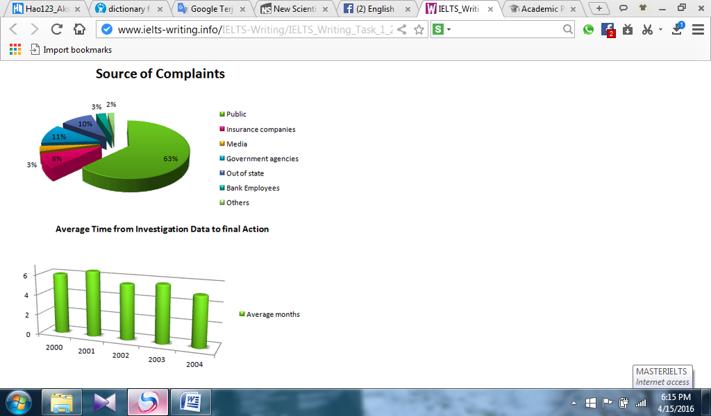
The resource of some grievance is classified in seven aspects during the period and displayed in the pie chart. The change of average month from data inquiry to final action on the average during the period 2000 and 2004 is presented in the bar chart. Units in the pie chart are measured in percentage. At first glance, it is proved that the pie chart shows that public becomes a major one. Furthermore, the bar chart clearly described that the average month in 2001 was found as the greatest rate.
To begin, there is a dramatic difference seen in the proportion of categories in the pie chart. It represents that public obtains the record as the biggest one at virtually 63%. It shows far higher proportion than other which only gains complaints at under 12%. The other is identified as the least one and is fairly low than bank employees and media. The gap between government agencies and out of state shows almost the same proportion as well.
Turning to the change of average time in bar chart, it can be seen clearly that trend experienced fluctuation slowly over 4 years. The average month in 2001 hit the highest level and at the end of time frame, the average month evened out the least stood at just over 4.

multiple_data_sets.p.png
