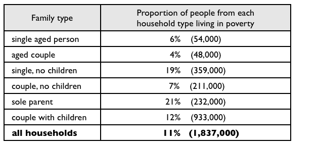
IELTS task 1 - Proportion of different categories of families living in poverty in Australia in 1999
I've just started to study IELTS so I hope everyone will be willing to help me. Thanks in advanced.
-----------------------------------------------------------------------------------------------------------------------------------------------------------------------------------------------
The given table illustrates the percentage of Australian from six different household types struggling with poverty in 1999. The data was measured in both percent and practical statistic.
It is noticeable in the last bold line that the number of poor Australian was really worth considering as it accounted for 11% of this country's population. Differed little from this, 933.000 people in couple-with-children families living below standard also made up 12% of their respective group. This record indicates that it is two times higher than 54.000 single aged individuals who suffered from financial problems.
As for aged couple, there was only 4% people living in poverty, thus the lowest position belongs to this group. In contrast, the quantity of poor Australian in sole-parent household category was the highest percentage (21%). This figure is 5 times higher than the lowest and clearly demonstrates the huge gap of economical statics between two kind of family, sole-parent and aged couple.
I've just started to study IELTS so I hope everyone will be willing to help me. Thanks in advanced.
-----------------------------------------------------------------------------------------------------------------------------------------------------------------------------------------------
Poverty in Australian society
The given table illustrates the percentage of Australian from six different household types struggling with poverty in 1999. The data was measured in both percent and practical statistic.
It is noticeable in the last bold line that the number of poor Australian was really worth considering as it accounted for 11% of this country's population. Differed little from this, 933.000 people in couple-with-children families living below standard also made up 12% of their respective group. This record indicates that it is two times higher than 54.000 single aged individuals who suffered from financial problems.
As for aged couple, there was only 4% people living in poverty, thus the lowest position belongs to this group. In contrast, the quantity of poor Australian in sole-parent household category was the highest percentage (21%). This figure is 5 times higher than the lowest and clearly demonstrates the huge gap of economical statics between two kind of family, sole-parent and aged couple.

6a0120a5bb05d8970c01.png
