Unanswered [1] | Urgent [0]
  

Home / Writing Feedback   % width   Posts: 3


The percentage of elderly aged over 65 in USA, Japan and Sweden from 1940 to 2040 - IELTS


ainunazwaria 10 / 17  
Mar 8, 2017   #1

scheme of elderly population


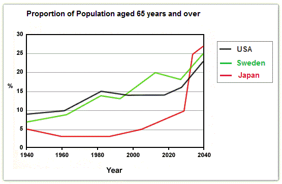
The line chart provides information about the percentage of elderly aged over 65 in USA, Japan and Sweden from 1940 to 2040. Overall, it is clearly seen that the proportion of people aged over 65 years in the three countries fluctuates during the given period. However, the three figures show an upward trend towards the end of survey.

The number of USA population initially stood at approximately 9% in 1940 while the figures for Sweden was about 7% at the same time. Then the former went up markedly and reached 15% as well as the latter figures showing a growth to just under 15% in 1980. Interestingly, after standing at the same level by around 14% in 2000, USA has been relatively unchanged while there has been a fluctuation figure in Sweden elderly population by 2020. Afterwards, both countries are predicted to rise towards the end of the survey. Nevertheless, Sweden population is expected reaching higher percentage than USA in 2014 ; approximately 25% and 23% respectively.

In contrast, Japanese figure was originally levelled off at 5% before dipping to 3% in 1960. The percentage then stabled for 20 years, after which there has been a gradually rise since 1980 and the figure is predicted peaking at 27% in 2040 after overtaking the first position from USA.

  • Academic_IELTS_Writi.jpg


Holt  Educational Consultant - / 15385  
Mar 8, 2017   #2
Ainun, there is a point between 2020 and 2040 when the line graph showed an illustrative point. Since you were concentrated only on the figures that were related to the years indicated, you failed to see that there was a possible discussion available for the year between the two. That should have been presented in the essay as well as a possible reference to 2030, the gap point between 2020 and 2040 which would have clearly indicated that you did a deep analysis of the information provided. If the examiner knows the chart very well and he knows of the existence of the midstream information that most students might not see as being there, this will definitely affect your task accuracy score. The effect will be in the form of only mechanical data being presented rather than analytical data. So the score for your essay cannot be higher than a 5.
akbarmappiare 31 / 445  
Mar 9, 2017   #3
Hi Ainun, I will give you a few corrections.
Actually, based on the systematic, you can successfully write this well. However, you cannot call an attention of the examiner if your overview is less interesting. You brought the data to flat information although you can impress the examiner through the overview. This below is the example of my offering.

Overall, it is clearly seen that the number of people aged over 65 years is more totally each year for those three big countries. In any case, the population for this category has shown the immense change rather the other countries.

Ainun, you are actually able to explore the data more and make your body paragraph more interesting. You are supposed to convert your data to forms of the equation so that those are more various. It seemed usual description because you only bring the data rigidly. In my view, you have shown your data unbalanced between the first and second body. You need to develop your ability in grouping the data.

Hopefully, those can help you to enhance your ability.
Happy Writing


Home / Writing Feedback / The percentage of elderly aged over 65 in USA, Japan and Sweden from 1940 to 2040 - IELTS
Need Writing
or Editing Help?
Fill out one of these forms:

Graduate Writing / Editing:
GraduateWriter form ◳

Best Essay Service:
CustomPapers form ◳

Excellence in Editing:
Rose Editing ◳

AI-Paper Rewriting:
Robot Rewrite ◳

Academic AI Writer:
Custom AI Writer ◳