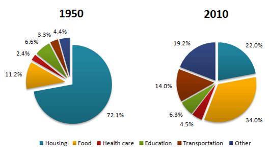
The pie charts below show the average household expenditures in a country in 1950 and 2010
The pie chart compares the amount of average consumption of family in one country from 1950 to 2010 compared by percentage. Overall, it can be seen that the largest change were in the percentage of consumption to the housing and food. All of consumption of family was increase until in the end period.
In 1950, the most favorite expenditure of people was housing, representing stood at 72.1% which was over a half of all consumption, and it was dramatic decrease in 2010 by just 22 per cent. People consumed food at 11.2%, it was the second largest of consumption and increasing more than threefold in 2010 at 34.0 per cent. Initially, average expenditures of people in the country on education, transportation, health care and other were fairly low, at only around just under seven per cent each.
Interestingly, in 2010, people used transportation increase enormously more than around fourth fold, at 14.0 per cent. The household spent of health care and education which were nearly changed not significantly. But consumption of family from other increased considerably from around four per cent to 19.2 per cent.

12573005_10206062801.jpg
