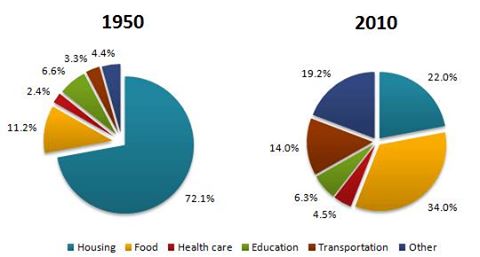
WRITING TASK 1 :The average household expenditures in a country in 1950 and 2010
The pie charts compares the expenditure of household in 7 different categories in a 60-year period. Overall, all figures showed a shift trend. In this case, decreasing rate was shown in both housing and education while the others figures witnessed the opposite.
A household expenditure was dominated by housing in 1950 at 72,1%, but by 2010, this had fallen to more than a fifth. Meanwhile, with 11,2 percent, food came as the second initially. However, this category increased significantly by around 23%, far outnumbering all figures at the end of the year.
Turning to another comparison, there were several basic necessities. At the beginning, there was a similar pattern shown in both health care and transportation in which they increased by 2% and 14% respectively after a 60-year period. This was in marked contrast to the figure for education experiencing a decline by 6,3 % at the end of the year.

pie_chart.jpg
