As a second-time IELTS taker, I desperately need your thorough feedback (please based on IELTS criteria) and advice to help me get a score of 8.0(at least)
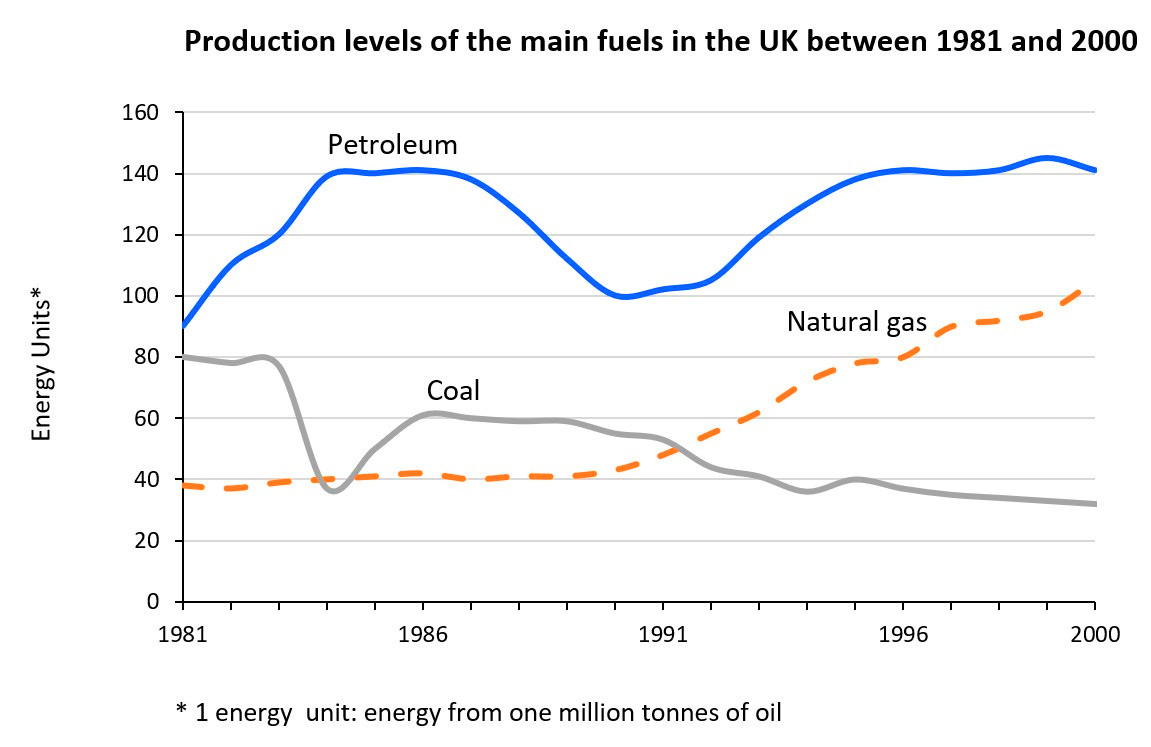
The graph below shows the production levels of the main kinds of fuel in the UK between 1981 and 2000.
Summarize the formation by selecting and reporting the main features and make comparisons where relevant.
The line chart illustrates the manufacturing scale of major fuels in the UK from 1981 to 2000.
Overall, it is clear that except for the reduction in the figure for coal, that of petroleum and natural gas experienced significant increases. Besides, the increment of natural gas is stable, helping it reached the second highest figure at the end of the period despite starting at the lowest. Meanwhile, although a remarkable decline was recorded in the data of petroleum and coal, the production level of petroleum still remained the highest thoughout the timeframe shown while that of coal finished at the lowest position.
In 1981, fuel manufacturers in the UK produced around 90 energy units of petroleum, which was about 10 and 50 units higher than that of coal and natural gas respectively. In the next five years, they increased the figure for petroleum substantially, which made it hit a peak of 140 from 1984 to 1987 before decreasing to 100 in 1991. However, the maufacturing levels of coal reached a bottom of about 39 unit in 1984 and those of natural gas remained nearly unchanged in the former half of the given period.
In the remaining years, despite some minor fluctuations, there was a gradual growth in the figures for petroleum with 140 energy units being generated from this fuel in 2000. Similarly, natural gas witnessed a continual incline to reached its peak of over 100 while a contrasting pattern was true for coal as only over 30 energy units were produced from this fuel in the final year of the period.

pastedimage0.jpg
