Hi everyone, please help comment on my writings. Thank you very much!!
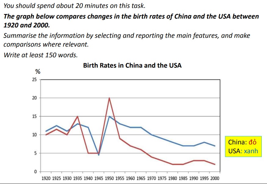
Requirement: The line graph compares birth rates in China and the US and how these rates changed from 1920 to 2000.
My writing: "The figure given illustrates the fluctuation in Chinese and American birth rates during the period of 80 years.
Overall, both countries saw a similar trend of reduction in their fertility from 1920 to 2000. Nevertheless, the birth rate of China was lower than that of the USA for most of the time.
In the 1920 to 1935 period, the birth rate of America varied constantly at around 12 percent before dropping sharply to just under 5 percent in 1945. However, this low rate did not remain for long, as the USA saw a considerable rise in their birth rate to a peak of 15 percent in 1950. Throughout the remaining period, this rate fell steadily to about 7 percent in 2000.
Over the first 10 years, Chinese birth rate fluctuated but was slightly lower than the American rate before overtaking the latter in 1935, after which there was a slump by 10 percent in 1940. The next 5 years saw no changes in Chinese birth rate; nevertheless, from 1945 to 1950, the rate climbed to its highest point of the 80-year period to exactly 20 percent. By contrast, 50 years later, the birth rate of China went down rapidly to only 2 percent by 2000."
Requirement: The line graph compares birth rates in China and the US and how these rates changed from 1920 to 2000.
the birth rate of America and China - the graph
My writing: "The figure given illustrates the fluctuation in Chinese and American birth rates during the period of 80 years.
Overall, both countries saw a similar trend of reduction in their fertility from 1920 to 2000. Nevertheless, the birth rate of China was lower than that of the USA for most of the time.
In the 1920 to 1935 period, the birth rate of America varied constantly at around 12 percent before dropping sharply to just under 5 percent in 1945. However, this low rate did not remain for long, as the USA saw a considerable rise in their birth rate to a peak of 15 percent in 1950. Throughout the remaining period, this rate fell steadily to about 7 percent in 2000.
Over the first 10 years, Chinese birth rate fluctuated but was slightly lower than the American rate before overtaking the latter in 1935, after which there was a slump by 10 percent in 1940. The next 5 years saw no changes in Chinese birth rate; nevertheless, from 1945 to 1950, the rate climbed to its highest point of the 80-year period to exactly 20 percent. By contrast, 50 years later, the birth rate of China went down rapidly to only 2 percent by 2000."

pict.jpg
