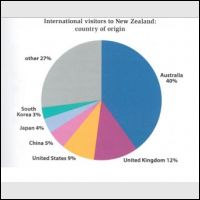
The pie chart illustrates several different citizenship of New Zealand's guests and is measured by percent. Those guests are from three different continents; Australia, Europe and Asia. Overall, it can be seen that the citizens who come from Australia and Europe continents place more than half of the overall percentage, while only small group of tourists from Asia continent who visit New Zealand.
The tourists from Australian and Europe continents; Australia, United Kingdom and United States, are the largest number. At the top of the percentage is Aussy, it takes 40 percent travellers. The second is British which takes 12 percent and the third is placed by American which takes 9 percent.
On the other hand, Asia continent which consists of South Korea, Japan and China, place the last three stages. Tourists who come from South Korea are only 3 percent from the overall visitors. While Japanese and Chinese who in New Zealand as tourists take 4 percent and 5 percent respectively.

l1c2.png
I'm really sorry for this. This is the right picture. Thank you
