Unanswered [3]
  

Home / Writing Feedback   % width   Posts: 3


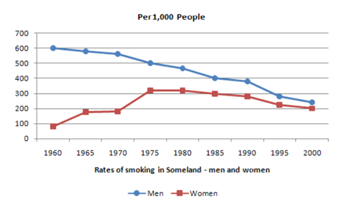
Write a report for a university lecturer describing the information in the graph below


phamkhatu 1 / -  
Aug 17, 2018   #1

rates of smoking in Someland


The given line graph illustrates reveals the rates of smoking in Someland between men and woman over the course of 40 years starting from the 1960s

As can be seem from the graph, It is clearly evident that both men and women in the rates of smoking in Someland witnessed and a downward trend over the time frame

In 1960, The rates of smoking in Someland registered the highest among the two, standing at 600 men, this rates decreased to about 550 men fifteen years later and then continued plunged to a low in the vicinity of 400 men in 1990s the following 10 years in this graph ,meanwhile brought a sustained decline in the figure of 240 men in 2000s, A similar trend could be seen in the rates of smoking in Someland , as it stood at in the vicinity 100 women in 1960s and soaring to reach 320 women in 1975s in very 1000 smoking women and then the rates brought a sustained decline from the top 320 in 1975s to 280 during the 1990s , In the late 1990s to 2000s the century, however, plunged to a low in the figure

In conclusion, we can totally see the rate of smoking in men dropped from the beginning to the end, the rate of smoking in women increased until 1975s but then decreased for the rest of the period

  • Write a report for a university lecturer describing the information in the graph below, please!!!!!!


Holt  Educational Consultant - / 15460  
Aug 18, 2018   #2
Tu, the trending statement should only be a single sentence in the presentation. What you did here is a constant presentation of the trend within the graph rather than creating a summary comparison for the given information. Being a 4 paragraph essay, you should have only presented about 175-200 words. 230 words is simply overkill and, with only 20 minutes to write this analysis, is impossible to attain during the actual test. Don't forget that you still need to proofread your paper so you can correct simple mistakes such as spelling errors (seem instead of seen).

One way of making this presentation shorter would have been to discuss the graph in a time bracketed manner. That means, you lump the information for analysis into groups of 3 years each. That way you can report about the lowest, middle, and highest points of each set without having to write too many words as you did in this essay.

Remember to divide your sentences with periods. You have a tendency to just keep on typing without considering any punctuation mark usage in your presentation. The essay becomes extremely difficult to read when you do that. It is a mistake that could result in a failing GRA score for you in an actual test. That will mean failing the test on a technicality that could have been avoided if you were just not careless about your writing style.
fuad hadi 1 / 3  
Aug 18, 2018   #3
The given line graph illustrates reveals
You should remove one of them, because they are both verbs

between men and woman over
you can change this word into women as plural form

I suppose as overall, the figure of women couldn't be said having a downward trend, because the number of female smokers rose over the period shown. I think, we can say that the number of smokers were predominantly men.

registered the highest among the two
i prefer not to use superlative because we compare only two things.

decreased to about 550 men ...
you count it wrong, it should be 500

then continued plunged to a low the vicinity of 400 men in 1990s the following 10 years in this graph
You used two verbs in one sentence, you can change plunge into plunging or remove "continued" , just remove the stricken part or you write "stood under 400", i think it is not efficient to write two similar adverbs of time.

similar trend could be seen in the rates of smoking in Someland
this part is vague, because it doesn't refer to women figure

you repeated the same phrase and preposition many times in your writing. i find it difficult to understand your writing, because it is not coherent and you made several grammatical mistakes. you made two separate paragraphs filled with conclusion. you separated the explanation for the two figures, you didn't make comparison between them.


Home / Writing Feedback / Write a report for a university lecturer describing the information in the graph below
ⓘ Need Writing or Editing Help?
Fill out one of these forms for professional help:

Best Writing Service:
CustomPapers form ◳

Graduate Writing / Editing:
GraduateWriter form ◳

Excellence in Editing:
Rose Editing ◳

AI-Paper Rewriting:
Robot Rewrite ◳