Writing Feedback /
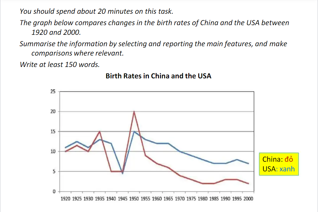
ielt task 1: the chart compare changes in the birth rate of China and US between 1920 and 2000 [6]
The line graph shows the proportion of birth in China and The USA from 1920 to 2000.
As can be seen from the graph, China and the US experienced a global downward trend by varying degrees.
Despite of a slight increase of 5 percent between 1920 and 1935, the percentage of baby boom in the US recorded a sharp decrease by 10 percent in the next 5 years, before reaching a peak of 20 percent at 1950. The figure indicated that a rapid fall in rate of birth in The US from 20 to nearly 2 percent was observed from 1950 on-ward.
At the 5 year start, the ratio of giving birth in China stabilized around 13 percent, however, in the period 1935 to 1945 saw a plummet of babies to 5 percent. US and China had a similar pattern in the 5 years after which has characterized by rocket of 10 percent in the rate of birth, before a sharp drop to 6 percent was undergone after that.
A further point of interest that in 1950 both of US and China came top of the list, they as well as had downward trend in the final time.

task1trend..png

