Unanswered [15] | Urgent [0]
  

Posts by skinnypeter
Name: peter george
Joined: Aug 3, 2021
Last Post: Oct 6, 2021
Threads: 3
Posts: 6  
Likes: 1
From: Netherlands
School: MSG

Displayed posts: 9
sort: Latest first   Oldest first  | 
skinnypeter   
Oct 6, 2021
Writing Feedback / The chart illustrates the long-term international migration in the United Kingdom [4]

(IELTS TASK 1) INTERNATIONAL MIGRATION IN UK


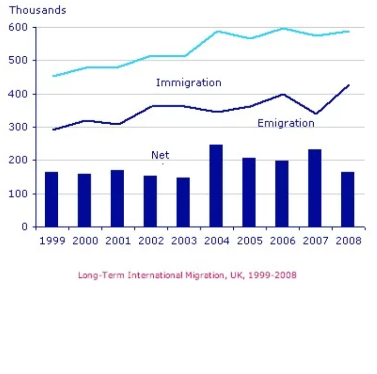
The chart illustrates the rate of immigration, emigration, and net migration in the UK from 1999 to 2008.

Overall, it is clear that UK immigration and emigration experienced a rise over the period shown, but a much higher rate of immigrants in comparison with emigrants. Net migration peaked in 2004 and 2007.

In 1999, the immigration rate was about 450,000 people, while the figures for emigration and net migration registered around 300,000 and 180,000 respectively. From 1999 to 2004, the number of people who immigrated to the UK rose by nearly 150,000 people. However, there was just a small growth in emigration from 300,000 people in 1999 to around 350,000 in 2002 before remaining at a similar level until 2004. Net migration peaked at about 250,000 people in 2004.

After 2004, the immigration rate remained stable until 2008, while emigration saw a significant fluctuation. To clarify, the rate of emigration declined suddenly to over 320,000 people in 2007 before reaching plateau at over 400,000 in 2008. As a result, net migration increased considerably to around 240,000 people in 2007 before falling back to over 150,000 in 2008.


skinnypeter   
Sep 26, 2021
Writing Feedback / Beside maximizing profit, all the companies should care about making benefits for society [3]

You should learn how to structure an essay like this.

In the essay, you have to answer " agree or disagree", and it is so different from " what extent do you agree or disagree" . Therefore, you need to pick a side to express your opinions, and give detailed examples about the topic.

You should have written "I completely agree with the idea that..."
skinnypeter   
Sep 3, 2021
Writing Feedback / Money parents spent on their children's sporting activities and how many kids participated in sports [3]

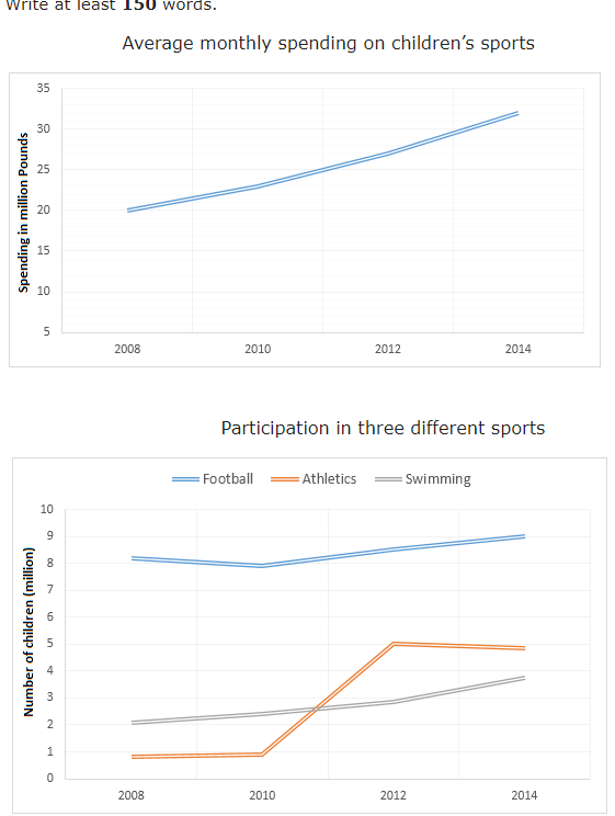
Average monthly spend on children's sports and participation in three sports


The line graphs illustrate how much money parents spent on their children's sporting activities, and how many children attended three kinds of sports, such as football, athletics, and swimming in Britain from 2008 to 2014.

Overall, it is clear that the average monthly amount that parents spent on their children's playing sports increased sharply. Similarly, the number of children playing the three kinds of sports experienced a growth over the period shown. Especially, the statistic for swimming had the fastest rise.

In 2008, British parents spent approximately 20 pounds monthly on their children's sports activities. Over the next six years, the average monthly spend went up steadily to around over 25 pounds in 2012 before reaching a peak at over 30 pounds in 2014.

There were 500 thousand children practicing athletics, and 2 million children participated in swimming clubs in 2008. However, almost 8 million British children played football in 2008. After 2008, the number of children in Britain playing football remained relatively stable until 2014. In contrast, the figure for swimming participation increased dramatically to around 4 million children in 2014 and there was a fivefold increase in the the statistic for athletics in 2014, with nearly 5 million children.


skinnypeter   
Aug 17, 2021
Writing Feedback / The chart shows the unemployment situation in Australia in the year 2012. [3]

You need to add the picture of the line graph beside your essay, which will help to understand your essay easier. Also, I think you use too many statistics in your essay, and you should focus on the important figures using more comparisons.

GBU
skinnypeter   
Aug 4, 2021
Writing Feedback / [ IELTS ] The line graph illustrates the number of cars that were owned by households in Britain [3]

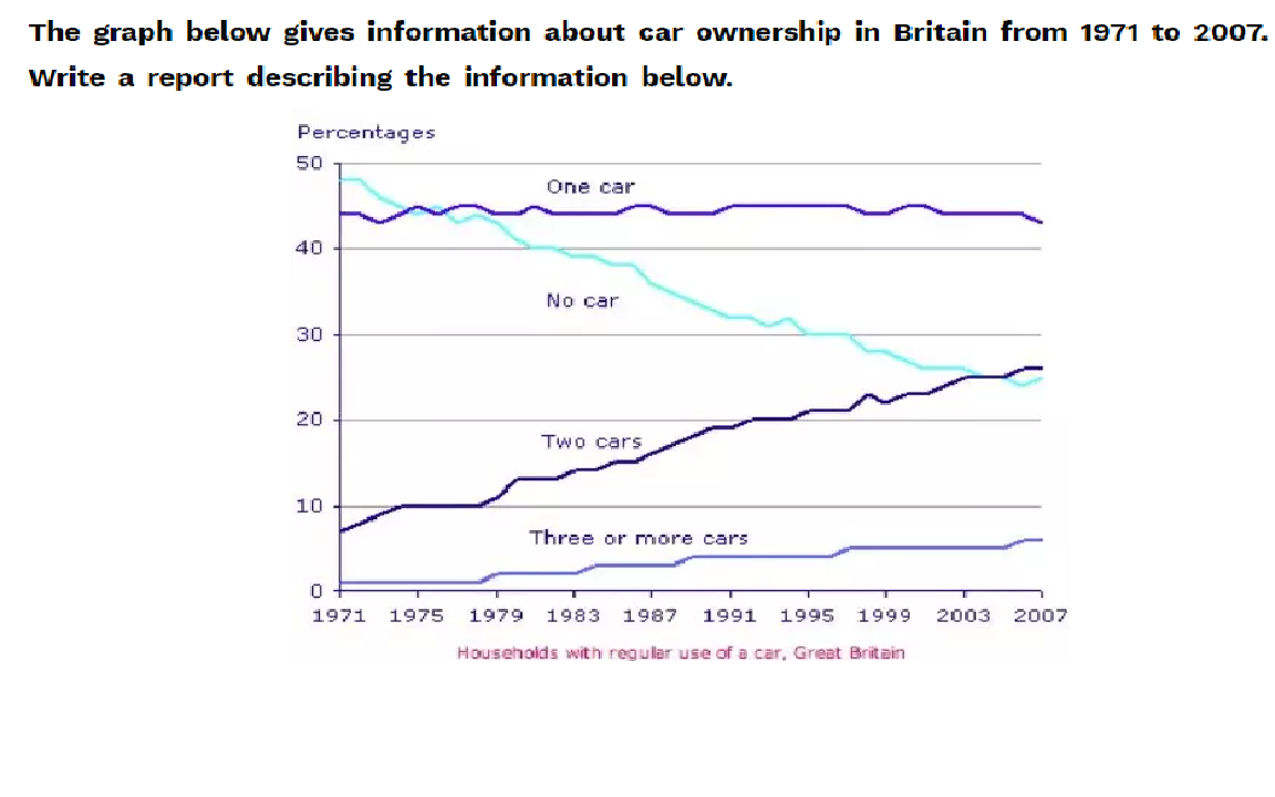
CAR OWNERSHIP IN BRITAIN


The line graph illustrates the number of cars that were owned by households in Britain between 1971 to 2007.

Overall, it is clear that car ownership increased during the period shown, while the number of households without a car fell dramatically.

In 1971, 49% of Britain households did not have a regular use of a car, and the percentage of households with a car was about 45%. It was uncommon for families having more three cars and two cars, by around 2% and 8% of households respectively.

The proportion of households that used two cars rose significantly to around 26% in 2007, while the statistic for families without a car experienced
a dramatic decline to 25% in 2003 before reaching the dip at 23% in 2006 ,and then growing again to 25% in 2007. In contrast, The percentage of households with a car remained stable from 1971 to 2007, and the proportion of households with more three cars increased slightly from 2% in 1971 to 8% in 2007.


Writing
Editing Help?
Fill in one of the forms below to get professional help with your assignments:

Graduate Writing / Editing:
GraduateWriter form ◳

Best Essay Service:
CustomPapers form ◳

Excellence in Editing:
Rose Editing ◳

AI-Paper Rewriting:
Robot Rewrite ◳