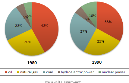
This is my report for the graph as attached that I wrote in 20 minutes. Please help collect any mistakes and try to guess what band score can I expect with it. Thanks a lot.
The two charts given show how the sources of energy changed in the USA from 1980s to 1990s.
In 1980s, oil was the most popular fuel in the US, supplying 42 percent of its overall energy, while the second popular was natural gas, accounting for 26 percent, a figure 4 percent higher than that for coal. The two types of clean energy, hydro power and nuclear power, shared the remaining 10 percent evenly.
Ten years later, although the percentage for oil dropped considerably by 9 percent to 33 percent, it remained as the biggest source of energy. The share of natural gas stayed roughly unchanged with a negligible decline of 1 percent, but coal supplied 5 percent more energy for the country. While hydro power was still representing 5 percent of this country's energy as it did a decade ago, the percentage of nuclear power had actually doubled.
Overall, we can see from the graph a trend of adopting greener forms of energy in the USA.
-- 166 words

G113.png
