Hi everyone,
Please check out my essay and give me some advice. I am really thankful for all of you who help me improve my IELTS writing skills.
Thank you so much.
I am wondering
1. whether using the future tense for the 2050 charts is correct?
because I use past tense for 2000 charts.
2. the word "represent" and "stand for " are used correctly?
3. if the essay structure should be revised?
ESSAY
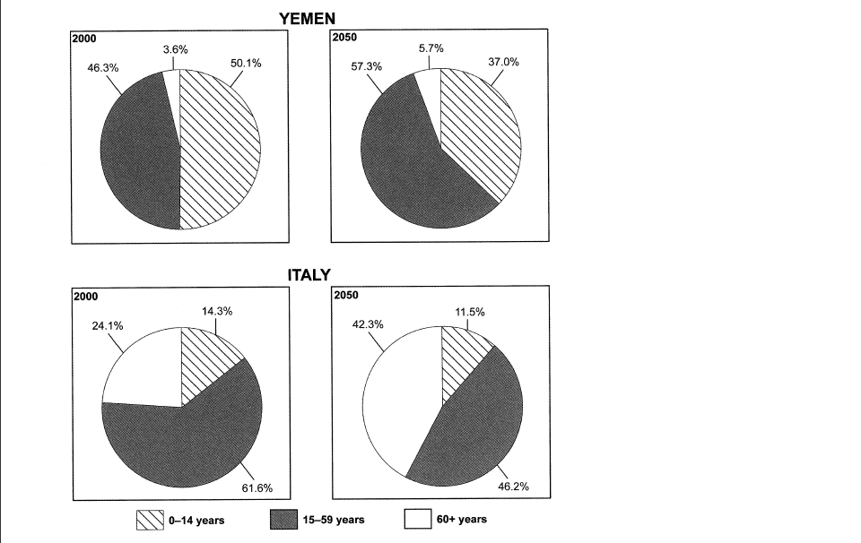
The four given pie charts illustrate the percentages of the ages of the populations in two countries, Yemen and Italy, during the years of 2000 and 2050. Overall, there are three slices, representing 0-14 years, 15-59 years and 60+ years in each pie chart. In addition, the part of 15-59 years is the largest proportion among the three.
In 2000, the percentage of 0-14 years in Yemen was just over half (50.1%) and the data of 15-59 years was 46.3%. The rest, standing for over 60 years, was only 3.6%. After 50 years, the slice of 0-14 years in Yemen will decrease to 37%, while the age from 15-59 years will rise up by 11% to 57.3%. The elderly, similarly, will increase to 5.7%.
In terms of Italian, the percentage of 0-14 years was much less in contrast to the part in Yemen in 2002, with only 14.3% of people. Approximately 61.6% of Italian, however, represented the part of 15-59 years, and 24.1% was the old people. A few changes are predicted to happen in Italy over the period from 2000 to 2050. 46.2% of Italian will be aged between 15-59 years. Surprisingly, the aged will rocket up to 42.3% ,whereas the youths at the age from 0 to 14 will be only 11.5%.
Sincerely thank anyone who gives me any suggestions beforehand.
Please check out my essay and give me some advice. I am really thankful for all of you who help me improve my IELTS writing skills.
Thank you so much.
I am wondering
1. whether using the future tense for the 2050 charts is correct?
because I use past tense for 2000 charts.
2. the word "represent" and "stand for " are used correctly?
3. if the essay structure should be revised?
ESSAY
number of younger and older citizens in two countries
The four given pie charts illustrate the percentages of the ages of the populations in two countries, Yemen and Italy, during the years of 2000 and 2050. Overall, there are three slices, representing 0-14 years, 15-59 years and 60+ years in each pie chart. In addition, the part of 15-59 years is the largest proportion among the three.
In 2000, the percentage of 0-14 years in Yemen was just over half (50.1%) and the data of 15-59 years was 46.3%. The rest, standing for over 60 years, was only 3.6%. After 50 years, the slice of 0-14 years in Yemen will decrease to 37%, while the age from 15-59 years will rise up by 11% to 57.3%. The elderly, similarly, will increase to 5.7%.
In terms of Italian, the percentage of 0-14 years was much less in contrast to the part in Yemen in 2002, with only 14.3% of people. Approximately 61.6% of Italian, however, represented the part of 15-59 years, and 24.1% was the old people. A few changes are predicted to happen in Italy over the period from 2000 to 2050. 46.2% of Italian will be aged between 15-59 years. Surprisingly, the aged will rocket up to 42.3% ,whereas the youths at the age from 0 to 14 will be only 11.5%.
Sincerely thank anyone who gives me any suggestions beforehand.

pie_chart.png
