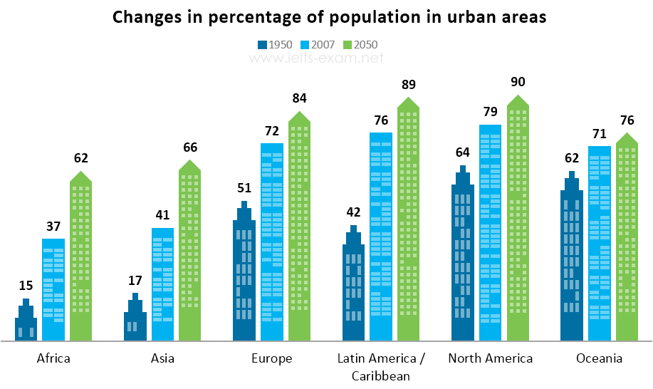
Changes in percentages of population
The bar chart below gives information about the percentage of the population living in urban areas in different parts of the world. Summarise the information by selecting and reporting the main features, and make comparisons where relevant.
The bar charts compare the ratio of the population in the urban region around the world in the years 1950, 2007 and 2050.
Overall, all trends of the population in cities from different continents experienced gradual declining growth throughout the period.
In 1950 the percentages of Africa, Asia, and Latin America/Caribbean are only 15%, 17%, and 42% separately. Latin America/Caribbean showed the highest upward trend among others, which increased by 34% between 1950 and 2007. However, the ratios of Africa and Asia are predicted that there would be the same growth of 25% in both continents exceeding Latin America/Caribbean, which will be only 13% in 2050.
Europe's percentage was the lowest compared to North America and Oceania in 1950. Nonetheless, it outpaced Oceania (71%) and reached 72% dramatically in 2007. It is also projected that this lead will keep remaining to the end of the period. Meanwhile, North America illustrated the highest percentage 64% and 79% among others in 1950 and 2007 respectively. It is even anticipated that it will hit the highest point in the world in 2050.
Hello Mr. Holt I wrote my Task 1 again with another topic. This time I did not write more than 190 words as you mentioned in the comment last time. Hope this time I could know what brand I might be able to score in Task 1. Besides, please let me know which part of my essay is my weakness. Then I could keep improving my writing skills. Thank you very much.

IELTS_Writing_Task_1.png
