GDP numbers in comparison on three different platforms
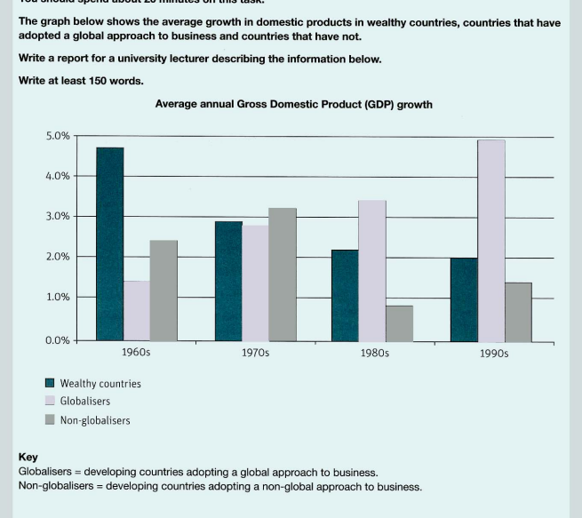
The provided bar chart compares the average growth in domestic products(GDP) in percentage for three types of platforms: wealthy countries, globalisers and non-globalisers during 40 years from 1960 to 2000. It is clear that the countries adopting globalisation would have GDP growth increased each year whilst there were only declining and unstable trends as to that of the remaining group in almost period.
In the years of 1960s, the highest proportion in GDP was roughly 4.7 % coming from wealthy nations while those figures for globalisers and non-globalisers stood at a low of just over 1 % and 2.4 % respectively.Over the next 3 decades, there was a considerable decrease to 2 % in GDP of the rich national group but there has been a steedy development up to nearly 5 % in the group of global approach nations since the first decade.
Regarding non-globalisers, their GDP figures were observed as such a minimal fluctuation reaching a peak of over 3% in 1970s and falling to a lowest point of under 1 % in 1980s then 10 years later, it slightly continued rising back to about 1.3 %.

data for this essay
