IELTS TASK 1 - LINE GRAPH
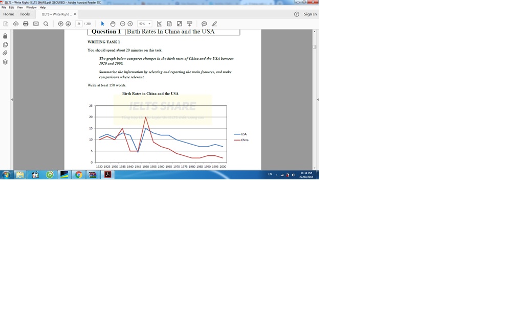
The line graph shows the Birth Rates and how it changed in two developed countries including the US and China from 1920 to 2000.
It is clear that both countries saw a decline in their birth rates between 1920 and 2000. It is noticeable that the birth rates in China was almost lower than in the US over a period of 80 years.
In 1920, the birth rates of China and the US was not significantly different, at approximately 10%. From 1920 to 1945, there was a plunge in both countries' fertility rates, while the birth rates in China hit a trough of 5% in 1940 and held steady for 5 years, the lowest fertility rates of America (5%) was in 1945. And 5% was also the lowest figure of Americans' birth rates throughout the 80-year period.
By 1950, China's birth rates had reached a peak of 20% and since then, it dropped considerably and hit an all-time low of nearly 2 percent in 2000. This situation was similar to the US's fertility rates which increased to 15% in 1950 and declined gradually to roughly 7% for the rest of the period.

LINE_GRAPH.jpg
