Unanswered [1]
  

Home / Writing Feedback   % width   Posts: 3


From the chart: Australians in terms of physical activity they partook in on a regular basis in 2010


Laurel Pham 1 / 1  
May 16, 2020   #1

IELTS Writing Task 1: physical activity


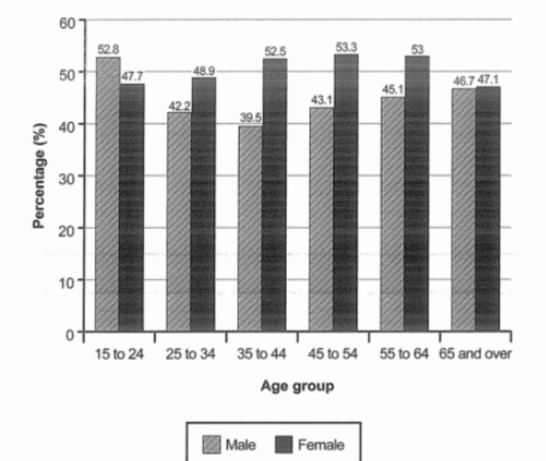
The bar chart below shows the percentage of Australian men and women in different age groups who did regular physical activity in 2010

The bar chart illustrates the proportion of men and women in six age groups in Australia in terms of physical activity they partook in on a regular basis in 2010.

Overall, men involved in physical activity more often than their female counterpart did. Additionally, both genders at the age of 65 and over shared the similar proportions in taking physical exercise regularly.

In the youngest age group (15 to 24), 52.8% was the percentage of male who participated in physical activity, which was slightly higher than the figure for their female counterparts, at 47.7%. By contrast, men were less active than women between the ages of 25 and 34. Likewise, in the age group 35 to 44, the proportion of men doing regular physical activity was 39.5%, which was around 10% lower than the figure for women.

Women in the age group 45 to 54 and 55 to 64 showed more interest in physical activity than their male counterparts, the percentages of women and men joined this kind of activity in the former group were 53.3% and 43.1% respectively, which were nearly similar to the figures in the latter one. The proportions for both genders aged 65 and over were slightly identical, at approximately 47%.

  • thebarchart.PNG


Holt  Educational Consultant - / 15461  
May 16, 2020   #2
For information conciseness, you should have included an indication of the age brackets. Something along the lines of "Ages measured ranged from 15 to 65 and over" would have helped add clarity to your summary overview. An inclusion of the measurement type, the percentage, would have also allowed you to present a complete presentation. You would have completed the summary of data requirements that way.

In your first data indicative paragraph. the 10 %lower figure for women should have been presented. It was included in the graph results so it should have been included in the report you wrote. Never leave an open ended information presentation. Always include all the facts so you can create an accurate data report. That will be your opportunity to show the examiner that you have the analytical ability to deliver a complete and properly formatted data report, which will increase your TA score. Complete the comparison discussion every time.

You don't need to indicate that the figures are similar if you are not going to do a comparative analysis of the figures. Such as statement requires the presentation of information to show the truth to your claims. Remember, this is a data report. Accuracy is just as important as the clarity of your explanations and grammar range.
OP Laurel Pham 1 / 1  
May 16, 2020   #3
@Holt
I really appreciate your feedback. Thank you very much!


Home / Writing Feedback / From the chart: Australians in terms of physical activity they partook in on a regular basis in 2010
ⓘ Need Writing or Editing Help?
Fill out one of these forms for professional help:

Best Writing Service:
CustomPapers form ◳

Graduate Writing / Editing:
GraduateWriter form ◳

Excellence in Editing:
Rose Editing ◳

AI-Paper Rewriting:
Robot Rewrite ◳