The chart below shows the results of a survey about people's coffee and tea buying and drinking habits in five Australian cities.
Summarise the information by selecting and reporting the main features, and make comparisons where relevant.
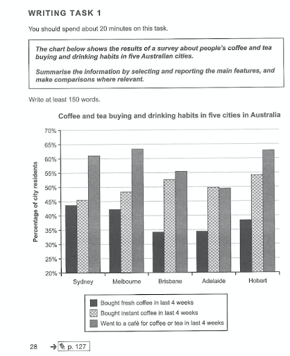
The chart illustrates the figures of five cities in Australia in terms of the habit of the citizen in purchasing and consuming coffee or tea. Overall, throughout four weeks, spending time at a café seemed to be the most popular option among all, while buying fresh coffee was not very preferable, peaking at the bottom for all of the five cities.
It is readily apparent that people in five chosen cities tend to have a habit of going outside for coffee or tea, as the percentages of that remain the highest in four out of five cities, reaching a peak of nearly 65% in Melbourne whereas being relatively high in Sydney and Hobart with approximately 61% and 63%, respectively. At the same time, the trend was not recorded in Adelaide, which just slightly below 50% of the people enjoy having their drinks at a coffee shop, being surmounted by the choice of buying instant coffee and coming at the second-highest option. Adelaide was the only city where purchasing instant coffee was the most chosen choice among all with 50%, as it always comes at the second-highest in other cities.
In contrast, purchasing fresh coffees was the least frequent choice among the people being surveyed, as it hit the bottom of the chart for all of the given cities, which the lowest percentage being noted was under 35% in both Adelaide and Brisbane. A similar pattern was also spotted in other cities, in which the percentage of people buying their own coffee ranged from nearly 43% to slightly under 45% in Sydney and Melbourne, respectively. In Hobart, the recorded number was still relatively low, staying at below 40%.

unnamed.png
