Unanswered [2] | Urgent [0]
  

Home / Writing Feedback   % width   Posts: 2


The chart below shows the average hours spent per day in leisure and sports activities, by youngest


Evelyn2k2 1 / -  
Sep 4, 2020   #1

statistic of leisure time spent


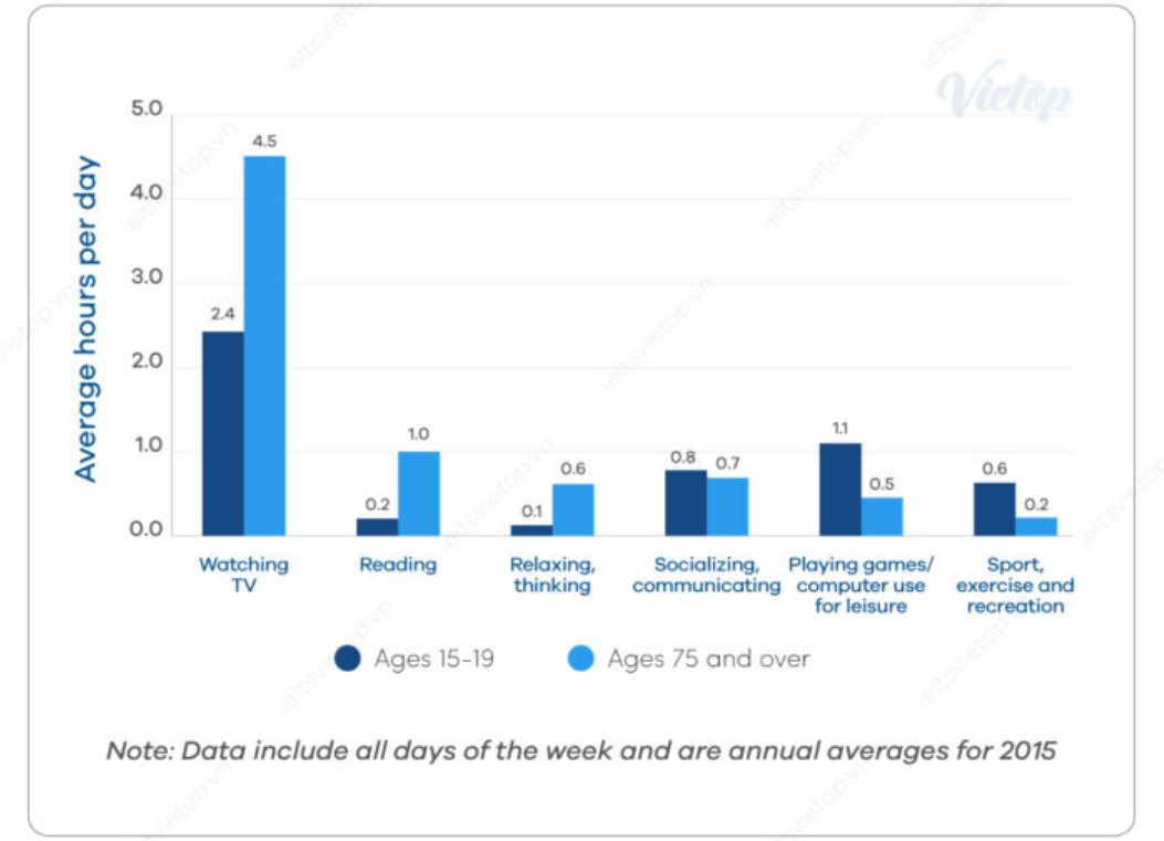
The chart below shows the average hours spent per day in leisure and sports activities, by youngest and oldest populations, in the US, in 2015.

The chart makes comparison on how many hours the youngest and the oldest in the US spent in leisure and sports activities per day in the year of 2015. Overall, It can be seen that watching TV was an activity both groups of ages spent in the most, and the group of ages 75 or over dominated in Watching TV, Reading and Relaxing, Thinking.

In terms of Watching TV, the oldest population spent average 4.5 hours per day, which almost doubled the hours the youngest spent. 0.2 hours and 0.1 hours was the time the group of ages 15 - 19 spent in Reading and Relaxing, Thinking respectively, which is as a fifth and a third as the hours the oldest spent in the same activities. The number of hours the oldest population joined in Socializing, communicating was 0.7, which was 0.1 hours lower than that of the youngest one. The 15 - 19 aged group spent 1.1 hours in Playing games while the oldest just spent a half of that time in this activity. The youngest ones also were more active when spent 0.6 hours in Sport, Exercise activities compared to just 0.2 hours the oldest spent in.

  • 118775553_3649227211.png


Holt  Educational Consultant - / 15384  
Sep 4, 2020   #2
Your incorrect format is what affected this presentation negatively. You should have used a proper 3 paragraph format covering:
Par. 1: Summary overview + trending statement
Par. 2: Ages 15-19
Par. 3: Ages 75 and over

By allotting a specific paragraph for the elder age group, you would have been able to present a clearer analysis of the information from that particular bracket of the bar graph. The image provided is a bar chart, not a simple chart. Always identify the type of chart (line, pie, bar, etc.) Please take note that your last paragraph represents the information in a confusing manner because you jump around from the young to the old information throughout the discussion. This is why you have to allot a specific paragraph per chart representation. By grouping the information into proper presentation paragraphs you will manage to present a clear and easily understood data report.


Home / Writing Feedback / The chart below shows the average hours spent per day in leisure and sports activities, by youngest
Do You Need
Academic Writing
or Editing Help?
Fill out one of these forms:

Graduate Writing / Editing:
GraduateWriter form ◳

Best Essay Service:
CustomPapers form ◳

Excellence in Editing:
Rose Editing ◳

AI-Paper Rewriting:
Robot Rewrite ◳

Academic AI Writer:
Custom AI Writer ◳