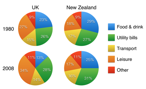
The breakdown of the proportion of patterns' household spending in UK and New Zealand from 1980 to 2008, a 28 - year period is presented in the pie charts. Overall, the patterns of household spending are dissimilar in both countries. In any case, while patterns of spending utility bills increased slightly, the figure for food and beverage experienced a gradual fall in both the countries.
To begin, 1980 had showed a slight increase in household spending of UK, from 27% to 34% in 2008. In addition, this case also occurred in the figure for utility bills of both countries. At 26%, the percentage of household spending' UK mounted gradually to 28%, and there was a steady rise of the same subject in New Zealand from over a quarter to almost a third of household spending in the second period.
In contrast, there was a sharp fall of spending's household in UK from 23% to 13%. This term is the same as did New Zealand, with falling four percent by twenty-five percent. In addition, spending of transport in the two countries witnessed one-percent drop by 14% and 16% irrespectively in UK and the other one. 1980 to 2008 saw a gradual decrease of percentage' spending leisure in New Zealand. The remaining figure solely dropped slightly.

The_charts_below_sho.png
