Unanswered [1] | Urgent [0]
  

Home / Writing Feedback   % width   Posts: 3


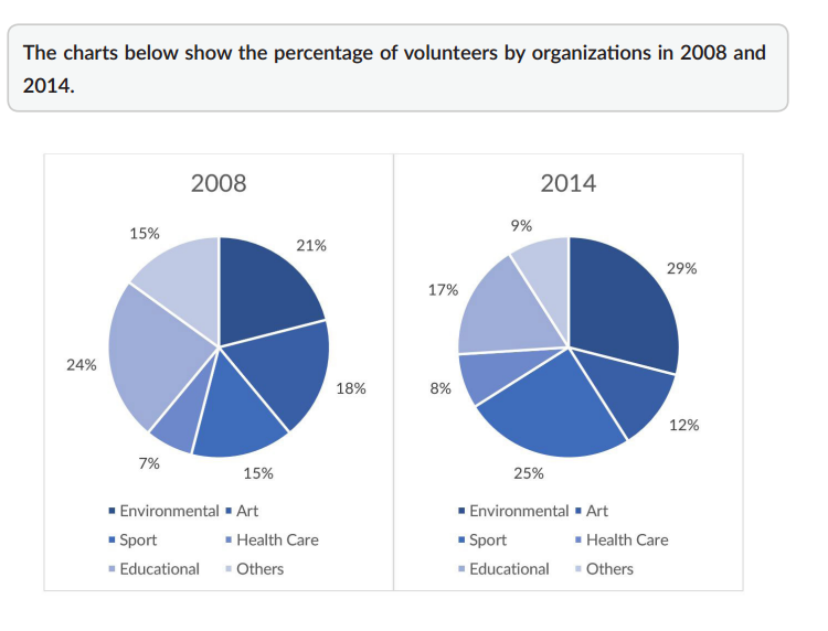
The charts below show the percentage of volunteers by organizations in 2008 and 2014.


HolanLovesMath 1 / 2  
Aug 28, 2020   #1

Charts about volunteers in various sectors


The given pie charts illustrate changes in the proportion of volunteers in six types of organization in 2008 and 2014.

It is clear that while the percentage of people who volunteered in environmental, sport, and health care organizations rose considerably from 2008 to 2014, the opposite was true for other types of organizations. Additionally, the proportion of volunteer participants in health care was by far the lowest in both years.

In 2008, volunteers in environmental projects accounted for 21%, three times that figure for health care, which was only 7 %. Over the next few years, in 2014, these figures witnessed marginal increases of 8% and 15% respectively. Likewise, starting at only 15% in 2008, the percentage of volunteer participants in sport rose almost double and made up for 25% in 2014.

At the same time, the proportion of volunteers in art and educational organizations experienced considerable decreases of 6% and 7% respectively. Also, there was a significant drop in that figure for other types of organizations to only 9% in 2014.

  • 6typesoforganizat.png


QuocHuu 7 / 14  
Aug 28, 2020   #2
well, your essay is in good structure, good lexical sources, both coherent and concise
Holt  Educational Consultant - / 15385  
Aug 28, 2020   #3
The summary overview is incomplete in presentation. Always provide a run-down of the easily seen information such as the number of charts, the measurement type, and the volunteer fields provided in the original image. Having said that, you first sentence is not change enough to be considered a restatement of the original instruction. It is 99% similar to the original so this will directly affect your TA score. You need to add more information, as I specified here, to prove that you understood the original prompt and varied the presentation to the point of originality.

Your 2014 review is not as complete as the 2008 chart. You spent too much time working on the trending statement, which should have been only a single sentence in the presentation. It is the improper focus on the trending presentation that caused your essay to be less informative than it should have been overall. Next time, try using the simple summary overview that produces the 3 paragraph essay instead. You should find that you end up presenting a clearer and better representative report than the 4 paragraph method that forces you to write more, but with less focus on the content, which is what you are primarily scored on on the Task 1 presentation.


Home / Writing Feedback / The charts below show the percentage of volunteers by organizations in 2008 and 2014.
Need Writing or Editing Help?
Fill out one of these forms:

Graduate Writing / Editing:
GraduateWriter form ◳

Best Essay Service:
CustomPapers form ◳

Excellence in Editing:
Rose Editing ◳

AI-Paper Rewriting:
Robot Rewrite ◳

Academic AI Writer:
Custom AI Writer ◳