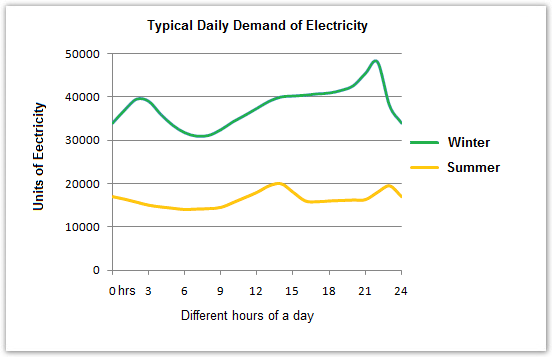
The graph below shows the demand for electricity in England during typical days in winter and summer. The pie chart shows how electricity is used in an average English home.
Summarise the information by selecting and reporting the main features and make comparisons where relevant.
The graph illustrates English's usage of electricity during summer and winter's ordinary days. Meanwhile, the pie chart compaes the purposes that this energy is used for in a typical household in England. As can be seen in the illustrations, electricity is used for mainly 4 sections of devices with the amount of which is significantly higher in winter than in summer.
In winter, people tend to consume electricity up to 48000 units, the highest rate of the entire season, in 22 hours while there is just more than 30000 units of it is used in approximately 8 hours, which is, in contrast, the lowest point of the time. On the other hand, the highest and lowest figures for summer are 20000 units in 13 hours and 12000 in 9 hours respectively.
Consumers seem to use the energy mostly to manipulate heating systems. Such activity accounts for more than a half of the chart. On the contrary, lighting/ TV/ radio sector makes up just 15%, being equal to vacuum clearners/ food mixers/ electric tools section.
I will be utterly grateful if you score my essay too.
Summarise the information by selecting and reporting the main features and make comparisons where relevant.
England's electricity essay
The graph illustrates English's usage of electricity during summer and winter's ordinary days. Meanwhile, the pie chart compaes the purposes that this energy is used for in a typical household in England. As can be seen in the illustrations, electricity is used for mainly 4 sections of devices with the amount of which is significantly higher in winter than in summer.
In winter, people tend to consume electricity up to 48000 units, the highest rate of the entire season, in 22 hours while there is just more than 30000 units of it is used in approximately 8 hours, which is, in contrast, the lowest point of the time. On the other hand, the highest and lowest figures for summer are 20000 units in 13 hours and 12000 in 9 hours respectively.
Consumers seem to use the energy mostly to manipulate heating systems. Such activity accounts for more than a half of the chart. On the contrary, lighting/ TV/ radio sector makes up just 15%, being equal to vacuum clearners/ food mixers/ electric tools section.
I will be utterly grateful if you score my essay too.

Academic_IELTS_Writi.png
Academic_IELTS_Writi.png
