TWO pie charts ANALYSIS
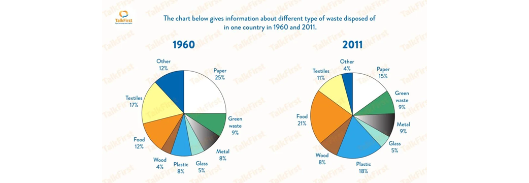
The 2 pie charts compare 9 categories of waste discarded in a particular country in 1960 and 2011. Overall, the initial impression is the amount of paper, textiles and other which were disposed of fell significantly while there was a considerable increase in the disposed plastic, food and wood. It can also be seen that the figures for glass and green waste remained unchanged.
In 1960, paper accounted for 25% of total disposal, but by 2011, this fell to slightly less than one-sixth. Moreover, the amount of textile experienced a significant drop from 17% to just over a tenth in the particular time frame. In terms of other, its figure in 2011 was three times lower (4%) than it was in 1960 (12%).
In contrast, the proportion of plastic discarded saw a substantial growth from 8% to nearly 1 fifth while the figure for wood was twice as high, at 8% compared to 4%. Another notable increase was in the percentage food thrown away, which by 2011 was nearly double the 1960 figure(12%). In a meantime, the disposal of glass, metal and green waste remained constant, with proportions of approximately 9% for the first two and 5% for the latter
For editing, content, and formatting needs please contact us at essayforum.com@gmail.com. Thank you! EF

Untitled.png
