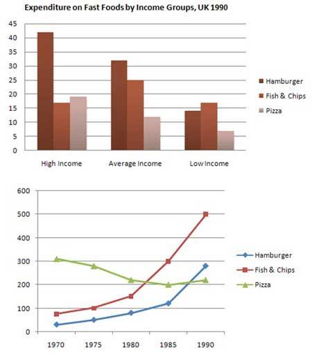
The bar and line chart given provide the data about the amount of expenditure spent on fast food, according to people earnings and the quantity of fast food consumption in uk during two decades. Overall, with the exception of fish and chips, fast food expenditure was dominated by people from high income salary; furthermore, while pizza experienced an upward trend, the opposite was seen in the remaining figures.
According to the bar chart, the high income people spent more than 40% of their earnings to consume hamburger and its number is quite significant compares with the other two types of fast food while the least percentage of fast food spent by them is fish and chips as much as 16%. Even thought the percentage of income spent by the average income people to consume hamburger is also the highest, the least percentage of fast food spent by them is pizza that is 11%. However, the low income people consumes fish and chips the most with the total number is more than 15% and surprisingly, the least fast food chosen by them is also pizza with the total percentage as much as 6%.
On the other hand, the line graphs showed that over two decades the trend of fish and chips and hamburger are highly increased with the number reached respectively is 500 and 300 while the amount of the pizza consumption is significantly decreased up to 200. It clearly can be shown that from 1970 to 1990, the fish and chips and hamburger experienced the steady increasing trend every year while the reverse trend happened to pizza.

mix_chart.jpg
