carbon dioxide emissions
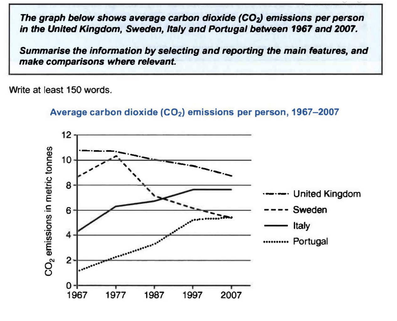
The given line graph illustrates how much carbon dioxide emissions per person on average in four different countries, namely the United Kingdom, Sweden, Italy, and Portugal, over a period of 40 years starting from 1967.
Overall, it is obvious that the amount of carbon dioxide emissions in Portugal and Italy saw an upward trend in the period time shown. On the other hand, the figure for the UK and Sweden is predicted to experience a fall.
Looking at the details, Portugal saw a gradual rise in carbon dioxide emissions of approximately four tonnes between 1967 and 2007. If we look at Italy, the trends are similar. It moderately increased from just over 4 tonnes to under 8 tonnes in the first 30 years, then remained stable until 2007.
In contrast, carbon dioxide emissions in the UK were highest by 2009, and then it went down over the 40-year period to just above 8 tonnes in 2007. Moreover, the figure for Sweden grew by two tonnes in 1977, after that it experienced a dramatic fall to under 6 tonnes in 2007.

ScreenShot202302.png
