Unanswered [1] | Urgent [0]
  

Home / Writing Feedback   % width   Posts: 4


A glance at graph provided reveals the individual carbon dioxide emissions in 4 European countries


CANDY ZHUANG 1 / 1  
May 16, 2023   #1

co2 emmisions graph analysis


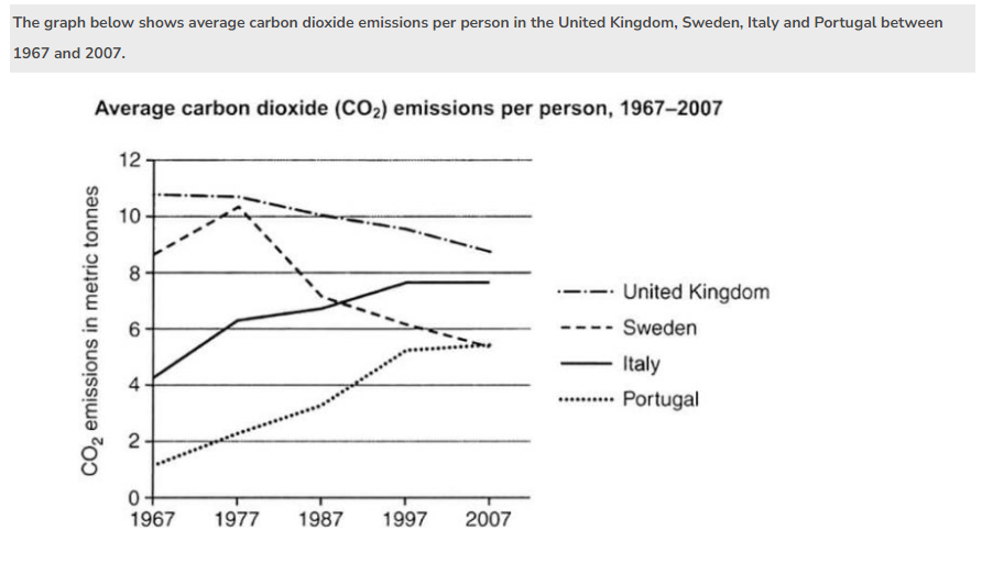
A glance at graph provided reveals the individual carbon dioxide emissions in 4 European countries: UK, Sweden, Italy and Portugal between 1967 and 2007.
In general, what stands out from the feature is that Portuguese and Italian emitted carbon dioxide less than Swedish and British in 1967. However, the trend changed from 1977 until 2007.

In 1967, the carbon dioxide emission was under 2 metric tonnes in Portugal and was slightly above 4 metric tonnes in Italy. The following years, both countries rose steadily by 4 metric tonnes, in which, grew from approximate 2 metric tonnes to under 6 metric tonnes in Portugal and from around 4 metric tonnes to approximate 8 metric tonnes in Italy.

Meanwhile, reaching a peak of somewhere in the vicinity of 11 metric tonnes in 1967, United Kingdom's citizen made a downward trend in carbon emission over period of time and finally reached the bottom at just under 9 metric tonnes in 2007. Also, Sweden's carbon dioxide emission was at under 9 metric tonnes in 1967. There was a noticeable growth to approximate 11 metric tonnes in 1977, before falling to a low at under 6 metric tonnes in 2007.

  • Screenshot2023051.png


Holt  Educational Consultant - / 15385  
May 17, 2023   #2
What sort of graph was provided? You did not properly identify the image in the summary paragraph. Was it a line or bar graph? You need to identify the image so that you can properly inform the reader who cannot see the report source. That means, you cannot refer to a glance at the image either.

Portuguese and Italian

Swedish and British

These descriptions refer to the citizens of the countries. These do not refer to the countries, which are what you were trying to refer to. Use the name of the countries next time.

The first reporting paragraph had a good start. However, after you used the reference "in which", you lost control of your word choice and thought clarity in the presentation. The later part of the paragraph became confusing for the reader. The last reporting paragraph was more coherent and should receive a better score than the first 2 paragraphs. These problems with word usage could prevent the essay from receiving a passing score though.
sooan - / 2  
May 18, 2023   #3
I think you should add sentences that compare the numbers with each other because in the graphs in ielts, the graders often emphasize the comparison, so the score can be higher. In addition, you should replace words with other synonyms to make sentences more diverse


Home / Writing Feedback / A glance at graph provided reveals the individual carbon dioxide emissions in 4 European countries
Need Writing
or Editing Help?
Fill out one of these forms:

Graduate Writing / Editing:
GraduateWriter form ◳

Best Essay Service:
CustomPapers form ◳

Excellence in Editing:
Rose Editing ◳

AI-Paper Rewriting:
Robot Rewrite ◳

Academic AI Writer:
Custom AI Writer ◳