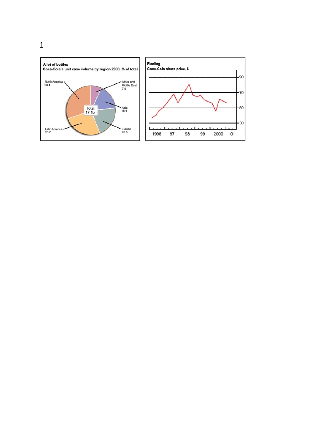
The chart and graph below give information about sales and share prices for Coca-Cola.
Write a report for a university lecturer describing the information shown below.
- You should write at least 150 words.
- You should spend about 20 minutes on this task.
The given pie chart gives the information about the sales of coca-cola in different countries in the year 2000. The line graph describes the share price of coca-cola from 1996 to 2001 in dollars.
From the pie chart it clear that, from the total consumption of 17.lbn, north America contributes 30.4% which was the highest among the five countries, followed by Latin America which was 25.7%. The difference between the two was nearly 5% only. Asia and Europe used 16.4% and 20.5% respectively and there was only 4% difference. Africa and Middle east consumed only 7.0% of the total coca-cola use.
The line graph clearly indicates the fluctuation in the share values of the coca-cola from 1996 to 2001. The value was least at 1996, which was nearly 35$ in 1996. It shoot up and reached nearly 70$ in the second quarter of 1997. Though it dropped in the following six months, it regained its value in the next nine months. The share price rocked during this period and reached the highest level of 80$ in the second quarter of 1998. Thereafter, the following two years, it shows significant fall in the share value with minimum fluctuation and touched the level below 50$ in the second quarter of 2000. During the next two months the value rose sharply and gained the level of 60$ in the third quarter of 2000, followed by a slight drop during the first quarter of 2001.
In short, America, both North and Latin are the highest consumers of coca-cola respectively, while Middle east and the Africa are the least. The share value of the coca-cola was at the peak during the second quarter of 1996 and least was at 1996.

1page0001.jpg
