Question
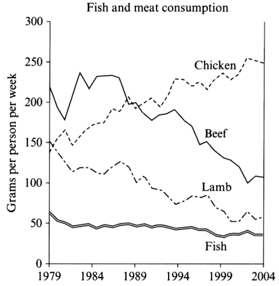
The graph below shows the consumption of fish and some different kinds of meat in a European country between 1979 and 2004.
Summarise the information by selecting and reporting the main features, and make comparisons where relevant.
My answer
The graph compared that the different kinds of fish and meat were consumed in a European country from 1974 to 2004. The total amount of consumption was 570 grams per person per week in 1979. After 25 years, the total amount decreased to approximately 480 grams.
In 1979, beef and lamb were the first and second high level for the consumption of meet, accounting for 230 and 150 grams, respectively. However, the data is shown a downward trend in the period. In 2004, both them decreased around 80 grams and became the second and third kind of meet in total amount.
In this country, each person consumed 140 grams chicken per week in 1979, but the amount gradually increased to 240 grams in 2004 and chicken became the highest level in the total amount. In contrast, fish contributed the lowest amount in the total consumption in 1979 and it still slightly decreased to 40 grams in 2004.
Overall, during this 25 years, the main consumption of meat and fish became chicken which was higher 100 grams than the second level of meat. In addition, fish made the lowest contribution in the whole period.

ieez_201711.png
