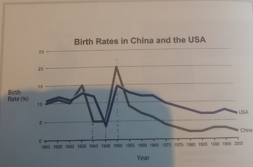
The graph below compares changes in the birth rates of China and the US between 1920 and 2000.
Summarize the information by selecting and reporting the main features, and make comparisons where relevant.
The line graph tracks changes of the birth rates of China and the US, the period covered from 1920 to 2000. To offer an insight into the trends, it is dissected into four phases by fluctuation in fertility - 1920-1930, 1930-1940, 1940-1950 and 1950-2000. This essay will move on to elaborate the underlying features in each stage and capture the differences between two countries.
Overall, China and America demonstrated striking similarity in the figures, their birth rates rising or falling simultaneously almost all the time. In both countries there were mild fluctuations in phase one, dramatic growth to their all-time high in phase three and constant declines in phase four, though China's birth rate changed with more volatility than America's in the 1930s. Another distinction is that China's highest birth rate was more than 15% higher as compared with its lowest, while the difference in the US stood just at approximate 10%.
The first phase featured an all but identical pattern of change in the birth rates of both countries. Having had a marginal growth to somewhere between 11 to 13 percent, they both slid back to the same levels as 1920, barely above 10%. Noteworthily, America's birth rate stayed about 1% higher than China's in the 1920s.
While such a trend continued in America for the decade to come, in China it gave way to a rapid increase to 15% in 1935 and eventually a drastic slump to 5% in 1940. Into the phase three, the birth rate of China bottomed out but that of America fell precipitously, to slightly short of 5% in 1945, its lowest point over the eight decades. Since then, their fertility began to soar and peaked at 20% and 15% respectively in 1950.
Passing over the climax, America and China went through a relentless decline in fertility over the next five decades to the vicinity of 7% and 3% each in 2000, despite occasional rallies in the rates. It was during this phase that China saw its lowest birth rate, well under five percent. The country was consistently exceeded by America in the rate by around 5% from 1955 onwards.
This time I tried to write five paragraphs and develop more complex sentences using 5 sentences per paragraph as suggested. I will continue to practice my writing this way. Though I also need advice on how to condense my essay, since writting such a detailed one is time-consuming and therefore not quite practical in an actual test. I would also appreciate it if you bother to improve my use of words, sentences or grammatical structures.
Summarize the information by selecting and reporting the main features, and make comparisons where relevant.
birth rates - China and United States Compared
The line graph tracks changes of the birth rates of China and the US, the period covered from 1920 to 2000. To offer an insight into the trends, it is dissected into four phases by fluctuation in fertility - 1920-1930, 1930-1940, 1940-1950 and 1950-2000. This essay will move on to elaborate the underlying features in each stage and capture the differences between two countries.
Overall, China and America demonstrated striking similarity in the figures, their birth rates rising or falling simultaneously almost all the time. In both countries there were mild fluctuations in phase one, dramatic growth to their all-time high in phase three and constant declines in phase four, though China's birth rate changed with more volatility than America's in the 1930s. Another distinction is that China's highest birth rate was more than 15% higher as compared with its lowest, while the difference in the US stood just at approximate 10%.
The first phase featured an all but identical pattern of change in the birth rates of both countries. Having had a marginal growth to somewhere between 11 to 13 percent, they both slid back to the same levels as 1920, barely above 10%. Noteworthily, America's birth rate stayed about 1% higher than China's in the 1920s.
While such a trend continued in America for the decade to come, in China it gave way to a rapid increase to 15% in 1935 and eventually a drastic slump to 5% in 1940. Into the phase three, the birth rate of China bottomed out but that of America fell precipitously, to slightly short of 5% in 1945, its lowest point over the eight decades. Since then, their fertility began to soar and peaked at 20% and 15% respectively in 1950.
Passing over the climax, America and China went through a relentless decline in fertility over the next five decades to the vicinity of 7% and 3% each in 2000, despite occasional rallies in the rates. It was during this phase that China saw its lowest birth rate, well under five percent. The country was consistently exceeded by America in the rate by around 5% from 1955 onwards.
This time I tried to write five paragraphs and develop more complex sentences using 5 sentences per paragraph as suggested. I will continue to practice my writing this way. Though I also need advice on how to condense my essay, since writting such a detailed one is time-consuming and therefore not quite practical in an actual test. I would also appreciate it if you bother to improve my use of words, sentences or grammatical structures.

QQez201708041754.png
