summarise the information from the graph
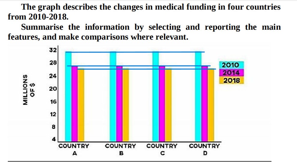
The given diagram displays the comparison of medication in four countries at eight-year intervals between 2010 and 2018 .
Overall, it is obvious that there was a sharp dip in medical resources or funds year by year , whereas millions of dollars were funded in four countries noticeably had the same figures.
In the year 2010, For country A 's millions dollars funding were declined roughly 5 millions after 4 years while a similar pattern was seen in country B .Furthermore, in 2018 both country A and B shared the same figures at nearly 25 million dollars, respectively.
For country C, the medical field in 2010 peaked at almost 32 million dollars and then dramatically fell throughout the period, 6 million dollars after 8 years. Similarly, country D in 2014 was expensed more than a quarter compared to 2010 when 8 years later the data was changed as the same as the other three countries.

topic
