Unanswered [1] | Urgent [0]
  

Home / Writing Feedback   % width   Posts: 5


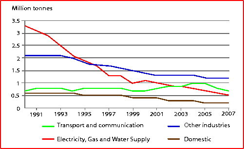
The graph below shows UK acid rain emissions, measured in million tonnes from four different sectors


ngockhanh181107 1 / 1  
Mar 19, 2021   #1

acid rain statistics in the uk


The line graph illustrates four different sectors that caused acid rain emissions in the UK over a 17-year period, from 1990 to 2007.
Overall, it is evident that the acid rain emissions that came from domestic were by far the lowest over the time shown. The enormous change was seen in the electricity, gas, and water supply.

In 1990, the highest level was seen in the electricity, gas and water supply, which was at approximately 3.3 million tonnes. It was followed by other industries and transport and communication, which were at around 2.1 and 0.7 million tonnes respectively. The amount of domestic just over 0.5 million tonnes, the lowest point of four sectors.

Over the following 17 years, there was a dramatic decrease in the quantity of electricity, gas and water supply and hit the lowest point at 0.5 million tonnes by 2007, a drop to nearly 3.5 million tonnes. At the same time, other industries and domestic were went down and bottomed out at 1.2 and 0.2 million tonnes respectively. In contrast to this, there was a slight decrease in the amount of transport and communication, which reached a peak at 1 million in 2005 then declined to nearly 0.75 million tonnes in 2004.

  • p.png


Holt  Educational Consultant - / 15384  
Mar 20, 2021   #2
Too many words. 205 words is geared towards the completion of a Task 2 essay. You should only write about 175-200 words for a better task 1 scoring potential. Your summary overview has a unique take on the information presentation. It shows that you know what exactly is included in the summary overview, and how to present it in an interesting manner to the reader. However, the most impressive trending statement was in the "overall" sentence. The "enormous change" reference isn't as impressive because there were no measurements given. To avoid having to present measurements for that sentence, it should have been better integrated into the "overall" presentation.

For comparison purposes, you may want to consider presenting the overlapping information, of which there are several in this graph. That will show a clear analysis of the presentation and, that you considered all possible discussion aspects and information presentation for this line graph.
juliachung 3 / 10  
Mar 20, 2021   #3
Hi friend,
"which were at around 2.1 and 0.7 million tonnes respectively" I think the word "at" is redundant in here. "were around..." is enough and "respectively" should be separated from the rest by a comma."

Due to my past mistakes in task 1, I was suggested to add more comparisons in the body instead of listing it only and I think it might be useful for you too. Great task by the way!
OP ngockhanh181107 1 / 1  
Mar 20, 2021   #4
@Holt
what band do you think this post is
LadyOfClockwork 30 / 100  
Mar 26, 2021   #5
Hi. As a reader, I'm not happy with the "enormous change" sentence.

First, I think you could make it clearer. What "enormous change" took place? Was it a dramatic decline, a sharp increase or a wild swing? Second, I think you could give a more comprehensive overview.

If I were you, I would write as below:

The period given saw declines in acid rain emissions from electricity, gas and water supply, domestic industry and industries assigned to the 'other' column, though by varying degrees.


Home / Writing Feedback / The graph below shows UK acid rain emissions, measured in million tonnes from four different sectors
Do You Need
Academic Writing
or Editing Help?
Fill out one of these forms:

Graduate Writing / Editing:
GraduateWriter form ◳

Best Essay Service:
CustomPapers form ◳

Excellence in Editing:
Rose Editing ◳

AI-Paper Rewriting:
Robot Rewrite ◳

Academic AI Writer:
Custom AI Writer ◳