Unanswered [14] | Urgent [0]
  

Home / Writing Feedback   % width Posts: 2


The graph shows the percentage of four different types of fuels in use between the years 1800 / 2000


diewithoutn 1 / -  
Jan 5, 2021   #1
Hello everyone, may you help me fix my essay,please?

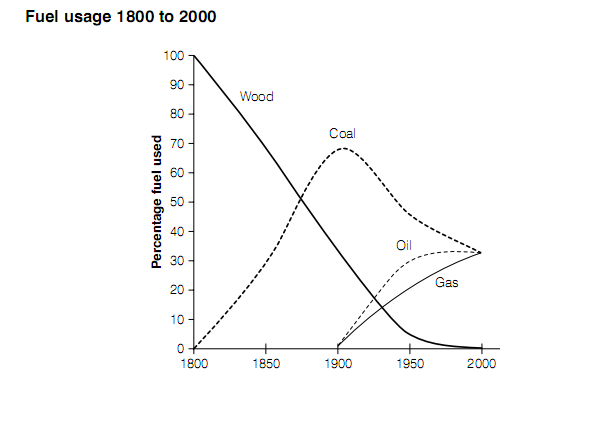
The graph shows the percentage of four different types of fuels in use between the years 1800 and 2000.


Summarize the information by describing the main features of the graph and making comparisons where appropriate.

The given line graph shows the results of a survey carried out to determine the percentage fuel used of 4 different categories during the period 1800 to 2000.

Overall, it can be inferred that from 1800s onward the proportion of firewood plunged dramatically while the rate of coal rose and fell erratically. In addition, oil and gas climbed over the period 1900 to 2000.

The initial impression from the chart is the collapse of percentage wood used, which dominated the fuel industry totally in 1800 went down substantially to almost 0 percent by 2000. While for 2 decades from 1800, the percentage of coal was from 0 percent reached a peak of 70 percent and also declined by just over a half in 2000.

Another significant feature in this graph is the appearance of oil and gas in the year 1900. Two types of fuel followed a similar pattern over the period and skyrocketed to the same figure of coal in the year 2000. Specifically, the rate of oil just increased marginally during last 5-year period.

  • percentage fuel used
Holt  Educational Consultant - / 14,835 4783  
Jan 6, 2021   #2
You have a neatly presented summary, but, it is more of a run-on than a complex sentence presentation. The sentence contains 3 different pieces of information:

- Type of image
- Topic of the image
- Measurement type
- Years surveyed

The clarity of the summary would have benefited from a single sentence presentation for each piece of information. That would have been the best way for you to meet the simple and complex sentence mix requirement per paragraph. By the way, you missed outlining the 4 types of fuel used. It should have been a part of the require summary information presented along with the reference to "different percentage fuel used" in a manner that would have properly created a complex sentence reference.

You have a good trending paragraph going there. However, the presentation sounds more like an under developed paragraph instead of a fully developed trending statement. When there is only 1 image involved, it is better to create a 3 paragraph presentation for clarity sake, rather than forcing a 4 paragraph presentation that does not meet the minimum paragraph requirements.


Home / Writing Feedback / The graph shows the percentage of four different types of fuels in use between the years 1800 / 2000
Writing
Editing Help?
Fill in one of the forms below to get professional help with your assignments:

Graduate Writing / Editing:
GraduateWriter form ◳

Best Essay Service:
CustomPapers form ◳

Excellence in Editing:
Rose Editing ◳

AI-Paper Rewriting:
Robot Rewrite ◳