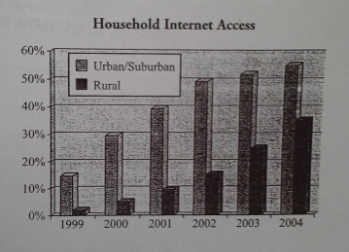
The graph below shows the percentage of urban/suburban and rural households in a European country that had Internet access between 1999 and 2004.
Summarize the information by selecting and reporting the main features, and make comparisons where relevant.
The graph illustrates the number of population who has access to the Internet of urban/suburban and rural areas in a European country during five years from 1999 to 2004, and is measured in percentage. Clearly, what stands out from the graphs reveals that suburban and rural areas increased steadily over the period. Noted, suburban areas record the highest percentage of all, and this figure shows significant percentage increases in the latter area.
...

TASK1_scoring4.PNG
