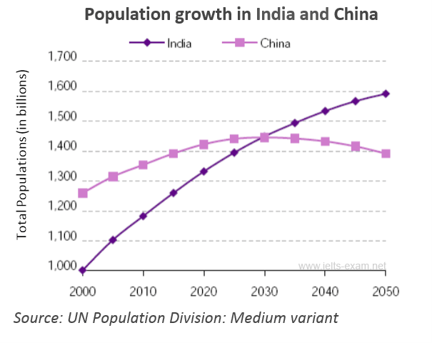
The line graph belows shows population figures for India and China since the year 2000 and predicted population growth up until 2050
Description of the graph given
*This is the first time I describe a graph, and the first time I prepare for the IELTS test, by the way. Thus, hope you guys will help me to correct it and give me the mark plz. tks
====
The provided line graph illustrates how population grow in two different countries over the period of 50 years.
Obviously, the habitants in China predictively decline, while in India the level of population dramatically increase.
In 2000, the number of Chinese is around 1,25 billions, whereas, in India the population is lower 0,25 billion. At present, the rate of population in China slightly goes up over 1,4 billion. In contrast, India's population continuously rises (1,3 billion).
According to the graph, from 2020 to 2050, the population growth between the two nations have different directions. While the figure of India soars to 1,6 billion, the population in China falls to 1,4 billions after approximate 25 years of rising.

IELTSWritingLineG.gif
