ACADEMIC IELTS WRITING TASK 1
THE TOPIC : THE GRAPHS BELOW SHOW THE PERCENTAGE OF DIFFERENT ELEMENTS IN THREE TYPES OF DIETS.
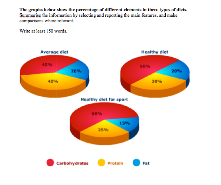
The pie charts provided reveal a comparison of the proportion of carbohydrates, protein and fat in three diets, namely an average diet, a healthy diet and a healthy diet for sport.
In general, what stands out from the graphs is that the percentages of carbohydrates in three diets are highest among three elements while the proportions of fat are lowest.
A closer look at the data reveals that the percentage of carbohydrates in a healthy diet for sport dominates the ranking among three diets, standing at 60%. This figure is 10% more than the proportion of carbohydrates in a healthy diet and 1.5 times as high as the percentage of carbohydrates in an average diet. Regarding protein, the proportion of protein in an average diet, which makes up 40%, is higher than 30% for that in a healthy diet and over twice times as large as that in a healthy diet for sport.
It is noticeable that the percentages of fat in three diets lag far behind, with only 15% in a healthy diet for sport. The figure for fat in an average diet and a healthy diet mark similar quantities, at 20% for each.
Thank you that much!!!

Screenshot_20200718_.png
