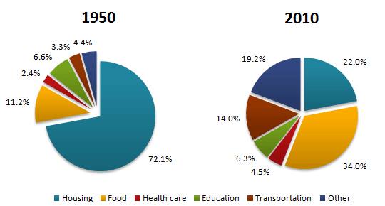
The pie chart compares the household outlays in a country between 1950 and 2010. Overall, It is clear that the household expenditures in all items showed an alteration during the time frame. With the exception of housing and education, all figures increased.
According to the graph, in 1950, housing became the majority aspect that societies spent their money for, but this fell dramatically to 22% in 2010. Meanwhile, with only more than one to twenty, education came in the third initially. However, its rate decreased slightly at the end of the period, making it place in the four rate.
Turning to another comparison, with 11,2 percent, food occupied the second position initially while a small proportion was seen in the figure for both transportation and healthcare. The 60 following years showed an increase in these data with around 11% and 2% for transportation and healthcare while a significant proportion by 23% was showed in the food, making it dominate all figures at the end of the period.

Pie_chart.jpg
