Appreciate for correction :)
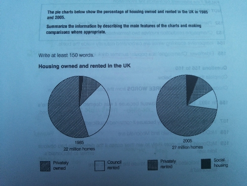
The given chart below shows the information about the housing owned and rented in 1985 and 2005 by British people.
However, the overall growth numbers of housing in UK increased dramatically in over 20 years with fascinating number by 22 per cent increasing.
In 1985, the pie chart also showed private owned housing as the top most percentage by more than 50 per cent while social housing became the least by 10 per cent resident prefer lived there. On the other hand, people who chose for stay in the council rented were 45 percent, and in the private house lived was 25 percent.
The differences of each group member occurred in the next 20 years period. Despite decreasing number of council rented housing, yet there were rising number among trends. Privately owned housing increased to nearly 75 percent while privately rented reached 15 per cent and 5 percent is gained by social housing.

Housing_owned.jpg
