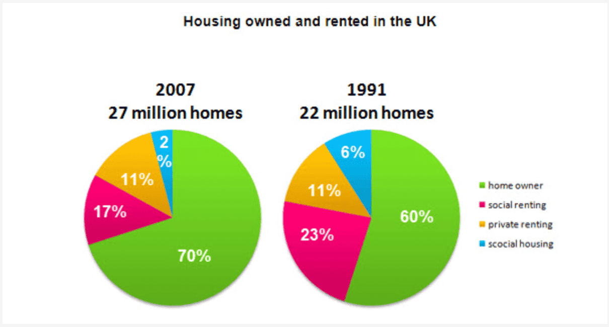
Question: The pie charts below show the percentage of housing owned and rented in the UK in 1991 and 2007.
Summarize the information by describing the main features of the charts and making comparisons where appropriate.
Answer:
The two pie charts indicate the changes in the percentage of housing market in the UK in 1991 and 2007. The overall number increased from 22 million homes in 1991 to 27 million homes in 2007, which is 5 million homes in 15 years, averaging more than 300,000 homes increase each year.
The most drastic change lies in the percentage of home owner, increasing from 60% to 70% in 2007, whereas the social renting dropped 6% and social housing also dropped from 6% to 2%. The percentage of private renting stayed the same - 11%.
The pie charts show the trend that house owning had become more preferred.

Screenshot2025-12-1.png
