Unanswered [1] | Urgent [0]
  

Home / Writing Feedback   % width   Posts: 4


Information about the comparison density in several areas from 1900 to 2000.


Putuariska 2 / 3  
Jun 18, 2016   #1

IELTS TASK 1 - World population in 1900 and 2000


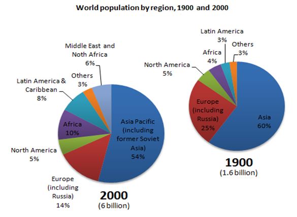
The pie charts below give information about world population in 1900 and 2000.

The pie charts described information about the comparison of population in several areas between year of 1900 and 2000. During those years, Asia was the most populous regional, while the other small regionals were the least dominates population in the world. Overall, the total number of people in the world increased almost 4 times from previous year.

Asia population dominated more than a half of population in the world which was 60% in 1900 and decreased to 54% in 2000. During the same period, citizen of European region, as the second populous areas in the world, also dropped to nearly 11%. Conversely, the number of people who lived in Africa went up from 4% to 10% in that period.

Other regions and North America had same growth during those years. They felt off at 3% and 5% respectively. However, Latin America was the only regional that had upward trend among the third least population countries. The growth rate started from 3% to 8% over the period.

  • world_population.JPG


pujakurniawan19 9 / 13  
Jun 18, 2016   #2
Putu, i think you have to clarify that boundaries between paragraphs

The pie charts described These charts shows information about the comparison of population density in several areas between year of 1900 and 2000 from 1900 to 2000. During those years, Asia was the most populous regional, while the other small regionals regions were the least dominates population in the world.

Overall, i t is clear that there was a sharply growth in total global proportion from 1.6 to 6 billion
.the total number of people in the world increased almost 4 times from previous year .
justivy03 - / 2265  
Jun 23, 2016   #3
Hi Putu, as I review your analysis, I must say you were able to explain the date presented in the charts, one thing to consider in explaining the given chart is by understanding the purpose of the charts and making sure that you provide a thorough information from the beginning of the analysis 'til the last part.

What I also like in your analysis is the uniformity of information, the unit of measurement is observed all throughout the analysis. However, when you revise the analysis, I hope you consider adding a few creative remarks towards rhe end of the writing in order to create ease in reading and understanding of what seemed like a very complicated chart.

I hope my insights helped and remember to keep an accurate analysis at all times, this will ensure your readers that you yourself understand the chart and knows exactly how to explain it further if any questions arise. Presenting the chart will also need a little research on the current standing of the subject towards current events, this will add personality and substance in your writing.
ichanpants89 16 / 742  
Jun 23, 2016   #4
Hi Putu, I would like to give additional remarks and modifications in order to make your essay develops better than before. I hope you can follow through the feedback given below.

1st paragraph:
- The pie charts describeddescribe information about the comparison of population in several areas between year of 1900 and 2000.
- During those yearsa century period , Asia was the most populous regional, while the other small regionalsareas/regions were the least dominates population in the world.

- Overall, it can be seen that, the total number of people in the world increased almost 4four times from previous year.the beginning of the period.

2nd paragraph:
- During the same period, citizenS of European region,...

3rd paragraph:
- Other regions and North America had sameequal growth rate during those years.
- They feltfell off at 3% and 5% respectively.
- Latin America was the only regionalregion that had an upward trend among the third least populationpopulous countries.

As seen, some corrections have been delivered. I hope this helps. Keep practicing Putu :)


Home / Writing Feedback / Information about the comparison density in several areas from 1900 to 2000.
Do You Need
Academic Writing
or Editing Help?
Fill out one of these forms:

Graduate Writing / Editing:
GraduateWriter form ◳

Best Essay Service:
CustomPapers form ◳

Excellence in Editing:
Rose Editing ◳

AI-Paper Rewriting:
Robot Rewrite ◳

Academic AI Writer:
Custom AI Writer ◳