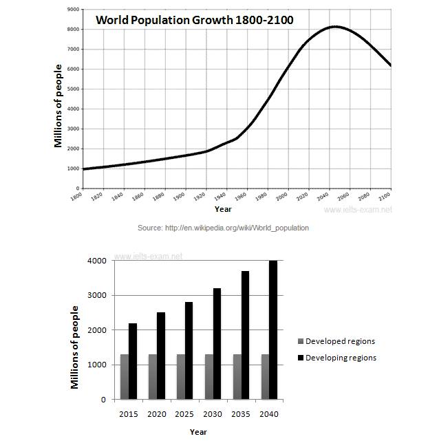
The graphs below provide information on global population figures and figures for urban populations in different world regions. Summarise the information by selecting and reporting the main features, and make comparisons where relevant
The line graph illustrates the world population growth between 1800 and 2100 in millions of people. While the bar chart shows predicted urban population figures for the next 25 years. Overall, it can be seen that, the population growth is increasing steadily from 1800 until middle period of report. However, the population in developing countries would be significantly higher than that of developed regions.
According to the first graph, the number of global population stood at 1000 in 1800, afterwards it experienced a slight increase and arrived at 2,000 in 1920. After that the population of the world simply boomed and it rocketed to 6000 million in the year 2000. The global population is expected to peak at 8.2 billion by 2050, and then decline to around 6.2 billion by 2100.
Regarding to the second graph, urban population in developed regions will remain stable approximately 1200 from 2015 to 2040. However, urban population in developing regions will increase start at around 2100 in 2015. On the contrary, the population of the developing country will keep increasing and would reach to 4000 millions in 2040.

12494850_10204376341.jpg
