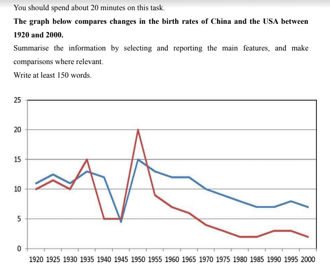
Changes in the birth rates 1920-2000
The chart illustrates the birth rates shifts between 2 developed countries namely China and the USA from 1920 to 2000.
The overarching trend is that both nations experienced a gradual decrease over the course of 20 years, in which there was a less substantial change in weight occur in the USA.
Taking a closer look at the graph, one can see that American birth percentage fluctuated around 12% in the first 20 years before hitting the low at less than 5% in 1945. Then there was a significant recovery, reaching to 15% in 1945, followed by a consistent decline to over 5% in 2000. In the case of China, its birth rate varied more dramatically than that of the USA over the same period. After dropping to 5% and remained stable from 1940 to 1945, it recovered and reached the highest points of 20% in 1950. Following that, the China's birth rate halved in 1955 and the downward pattern carried on to roughly 2% in the next 45 years.
Your comments and feedbacks are highly appreciated. Thank you!

11.png
